January–April 2025
OVERVIEW
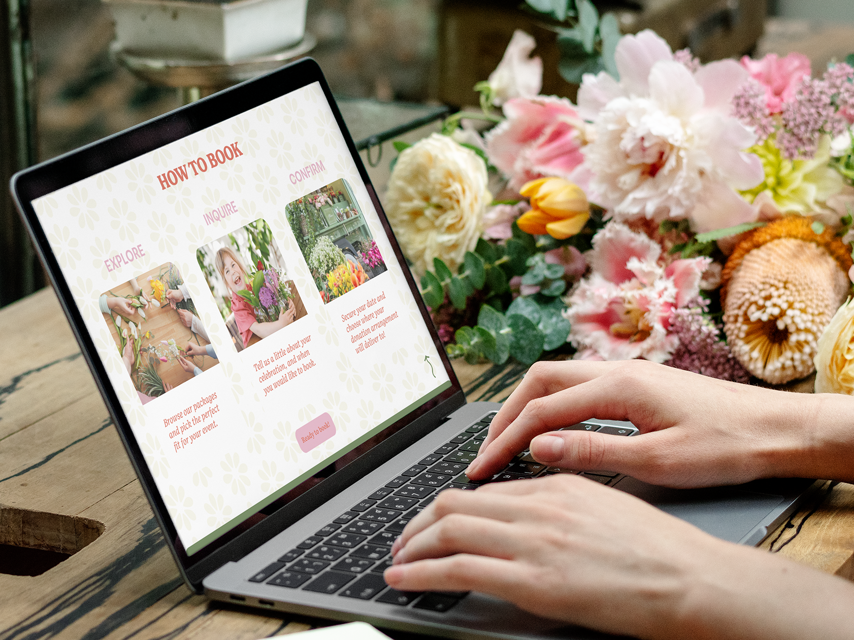
Create a travel journal design layout and cover illustration combining graphic design and layout design with passions for traveling and journaling to provide a tangible outlet for storytelling while offering a personal and reflective alternative to mainstream social media influence.
GOAL
Using Illustrator and Indesign, this project aims to deepen the connection between experiencing the world and sharing one's story by documenting memories in a traditional way for a personal reflective experience, challenging mainstream social media influence. This project will reflect marketing research and design research combined under a new brand, Taylor Designs, to produce a product, the travel journal. This journal will be a customizable experience for users to choose from 3 categories of layouts to create their own journal layout. The cover design will reflect a general look and feel of the personalized experience and be available in multiple color variations.
MENTORSHIP
Sarah Whitmore, Marketing Coordinator CIS Abroad. Sarah's degree is in interactive information design, with experience in publication work and leading workshops in magazine design.
WEEK 15
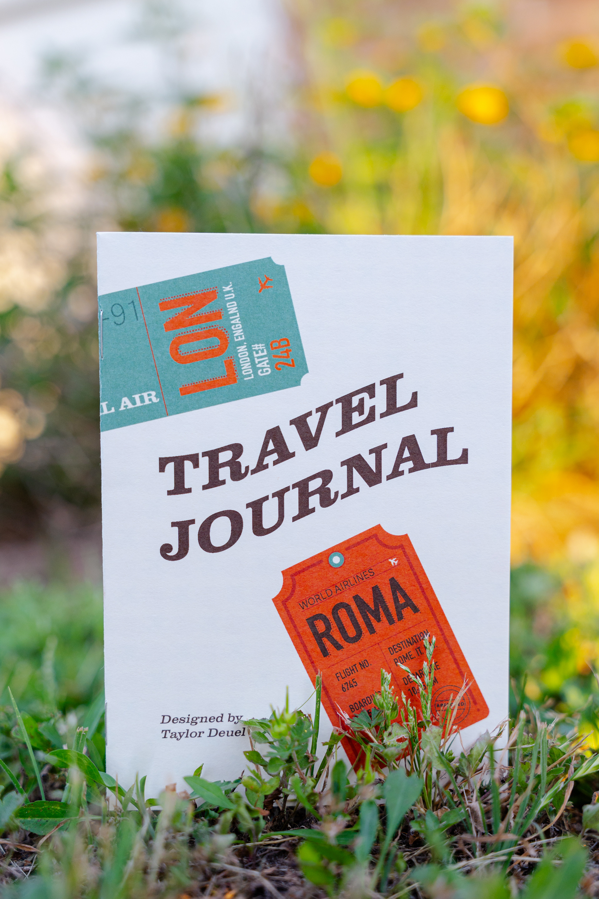
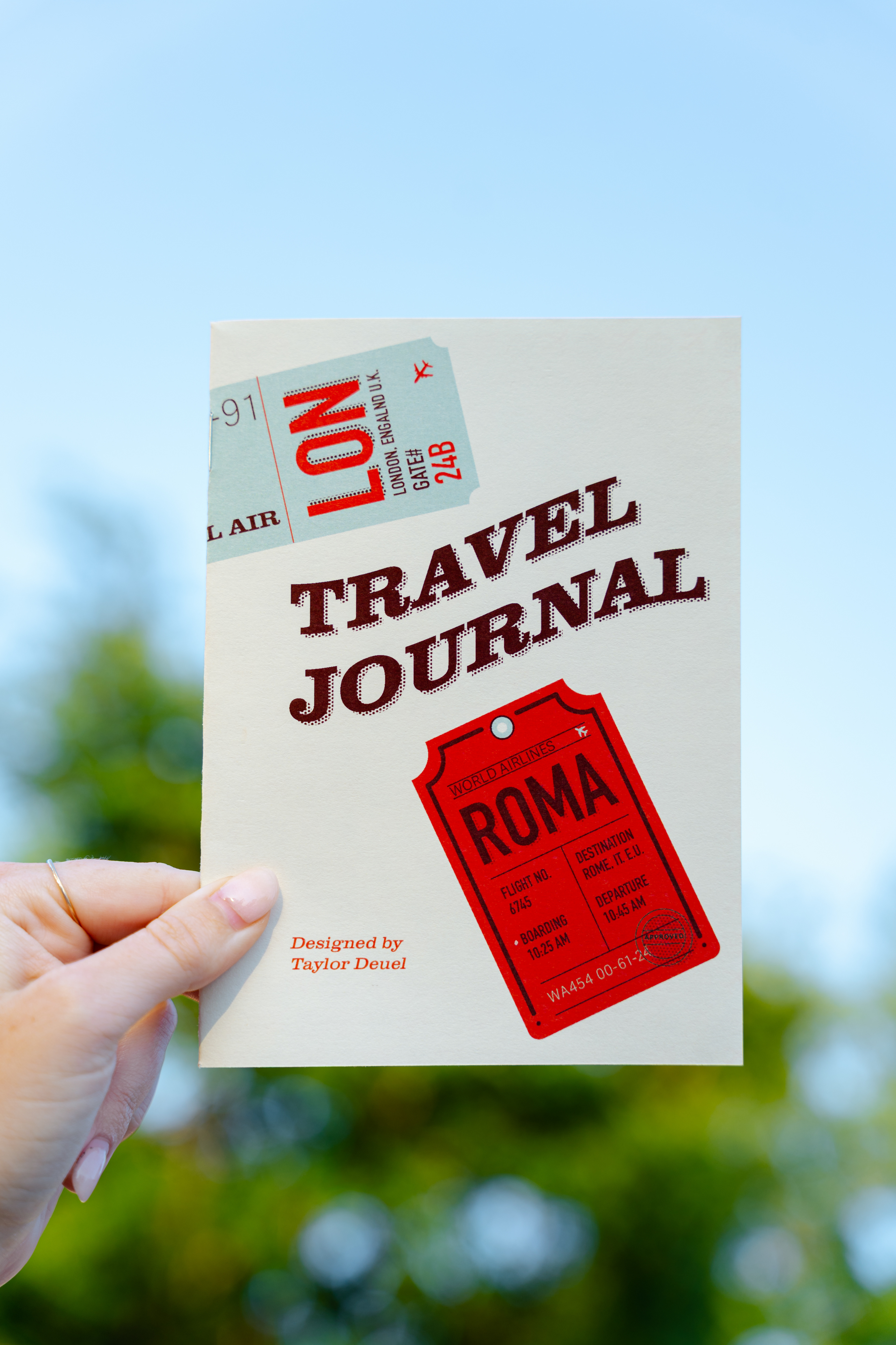
This week I finalized my cover designs, printed final copies, and photographed my final product. This project's deliverables include:
- 3 printed copies of the interior journal pages and cover designs.
- Final paper discussing research, project process and concluding challenges & discoveries.
- Final blog documenting weekly progress.
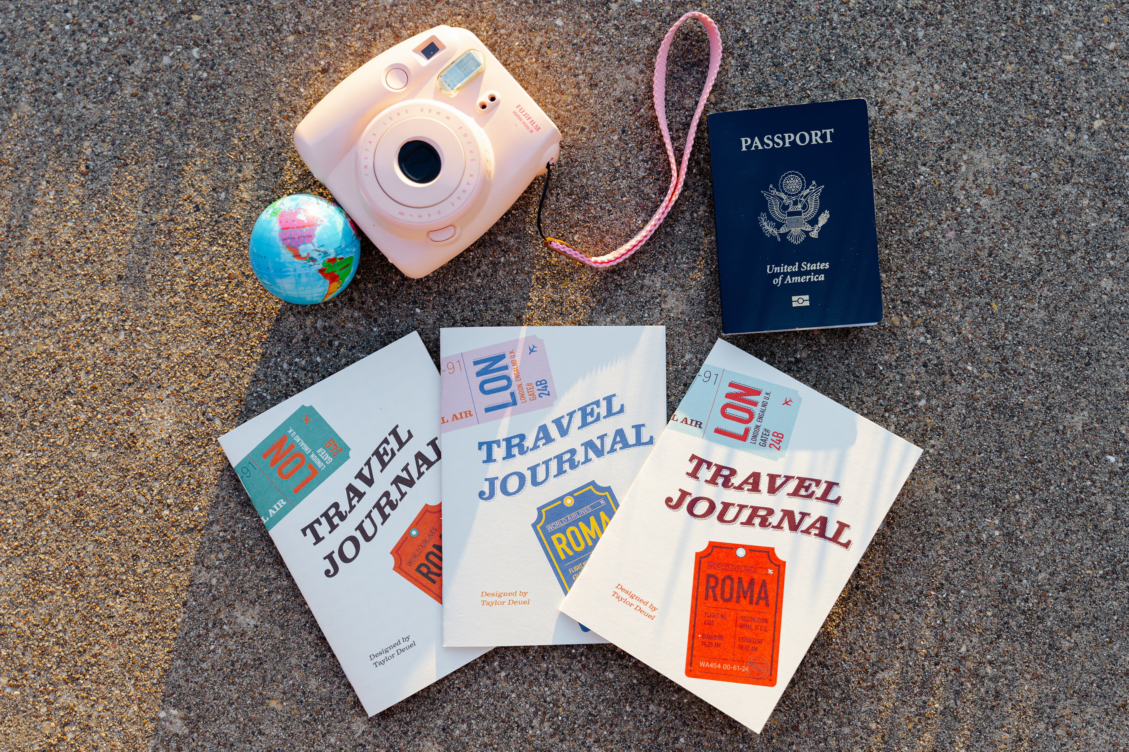
Final journal prints
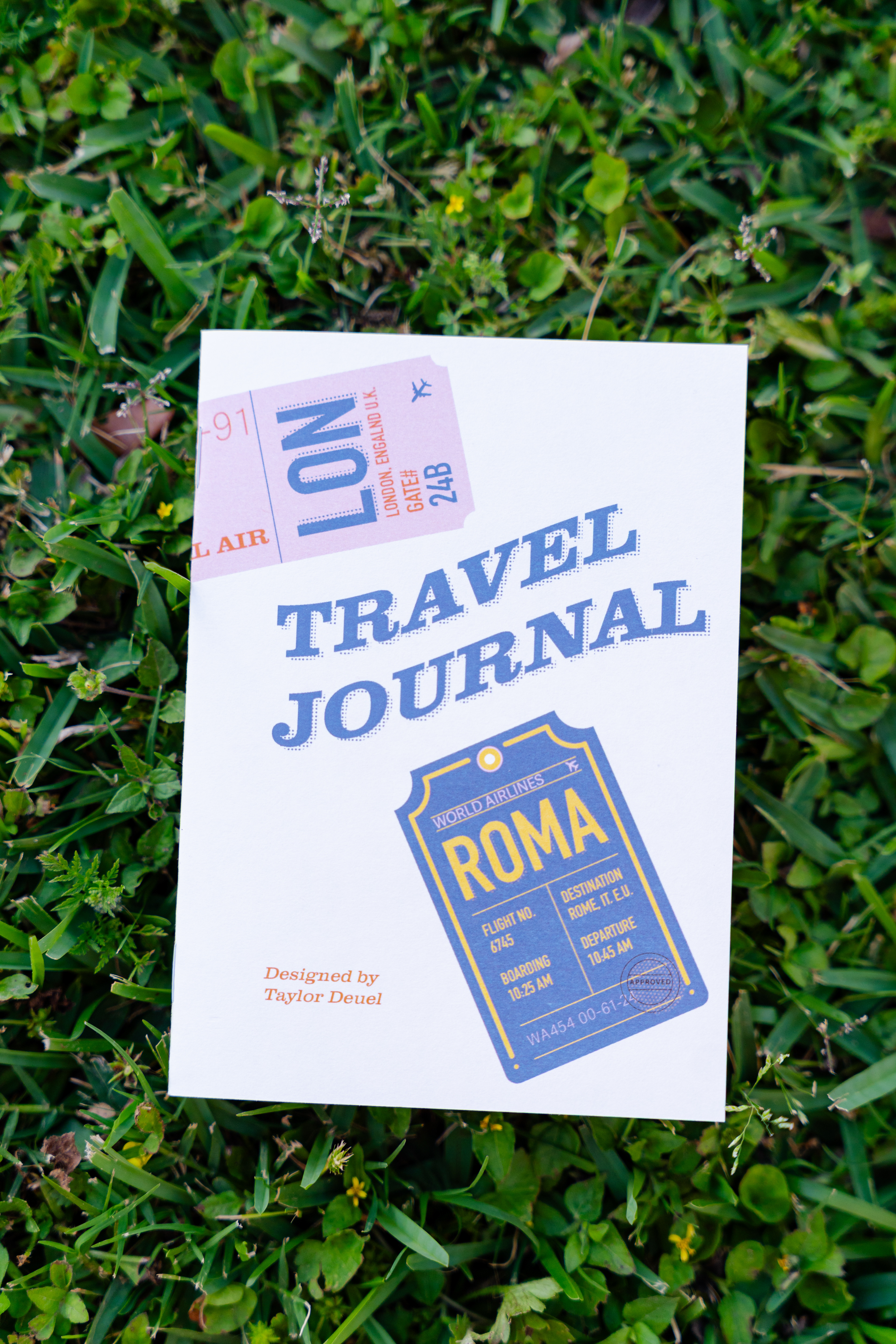
WEEK 14
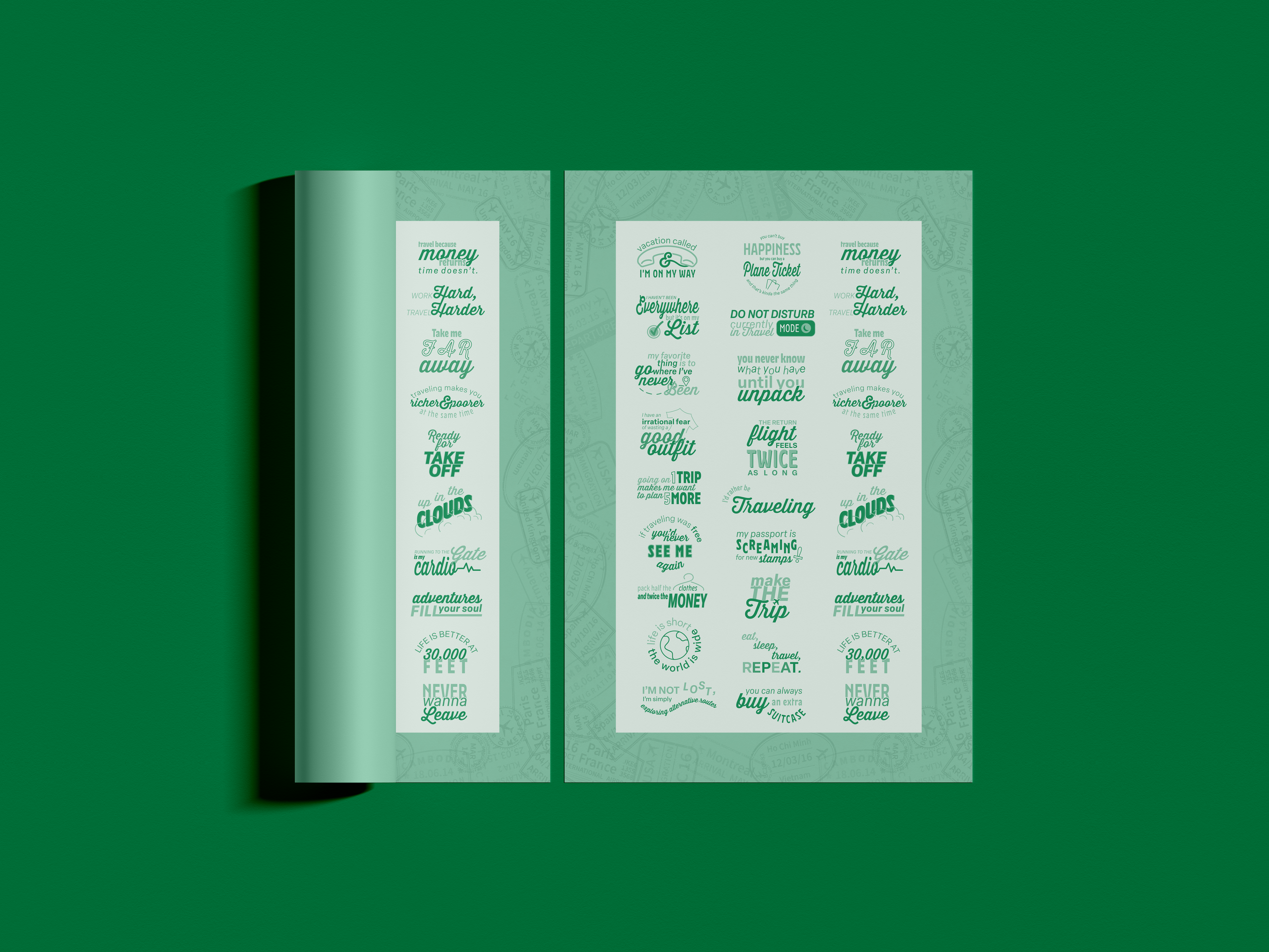
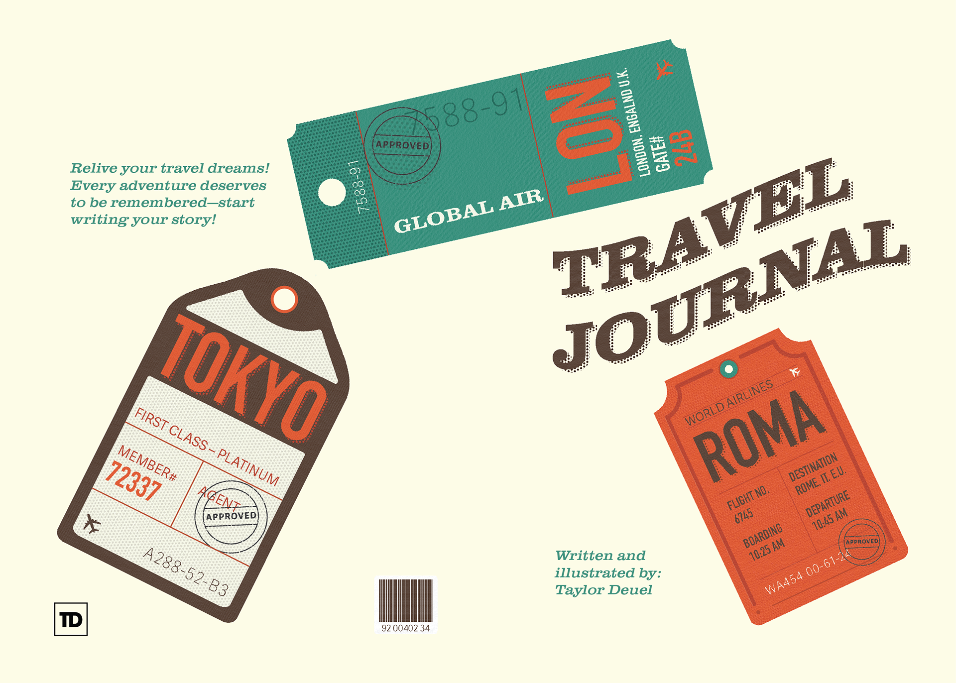
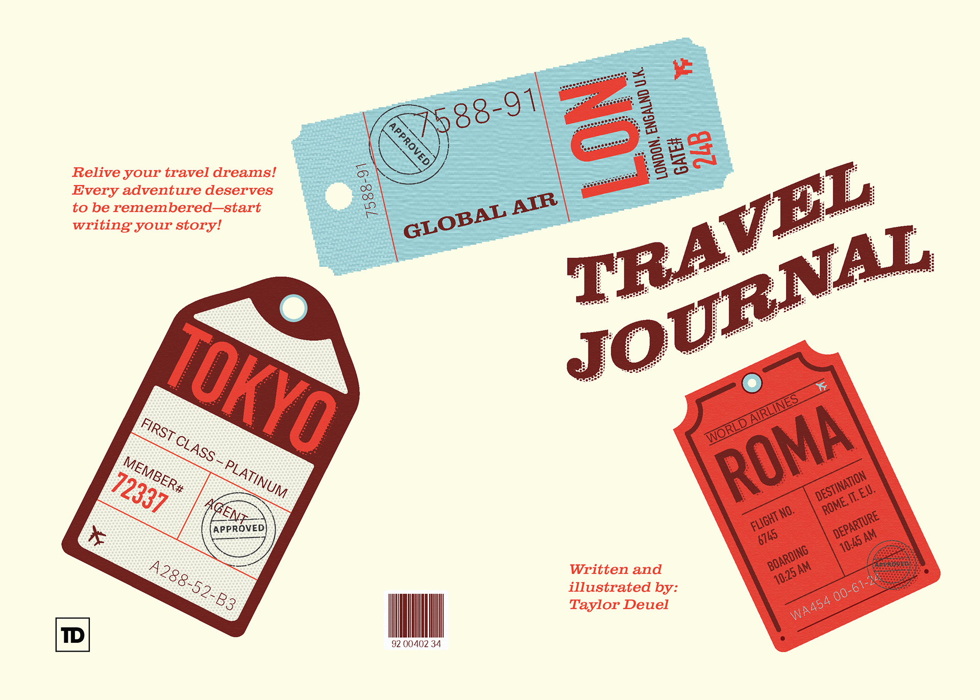
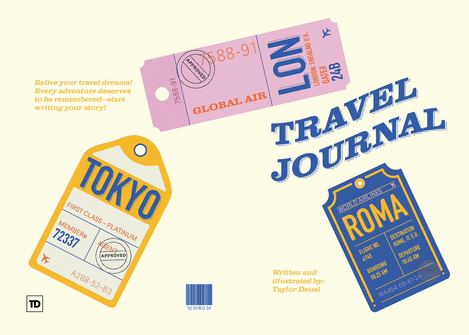
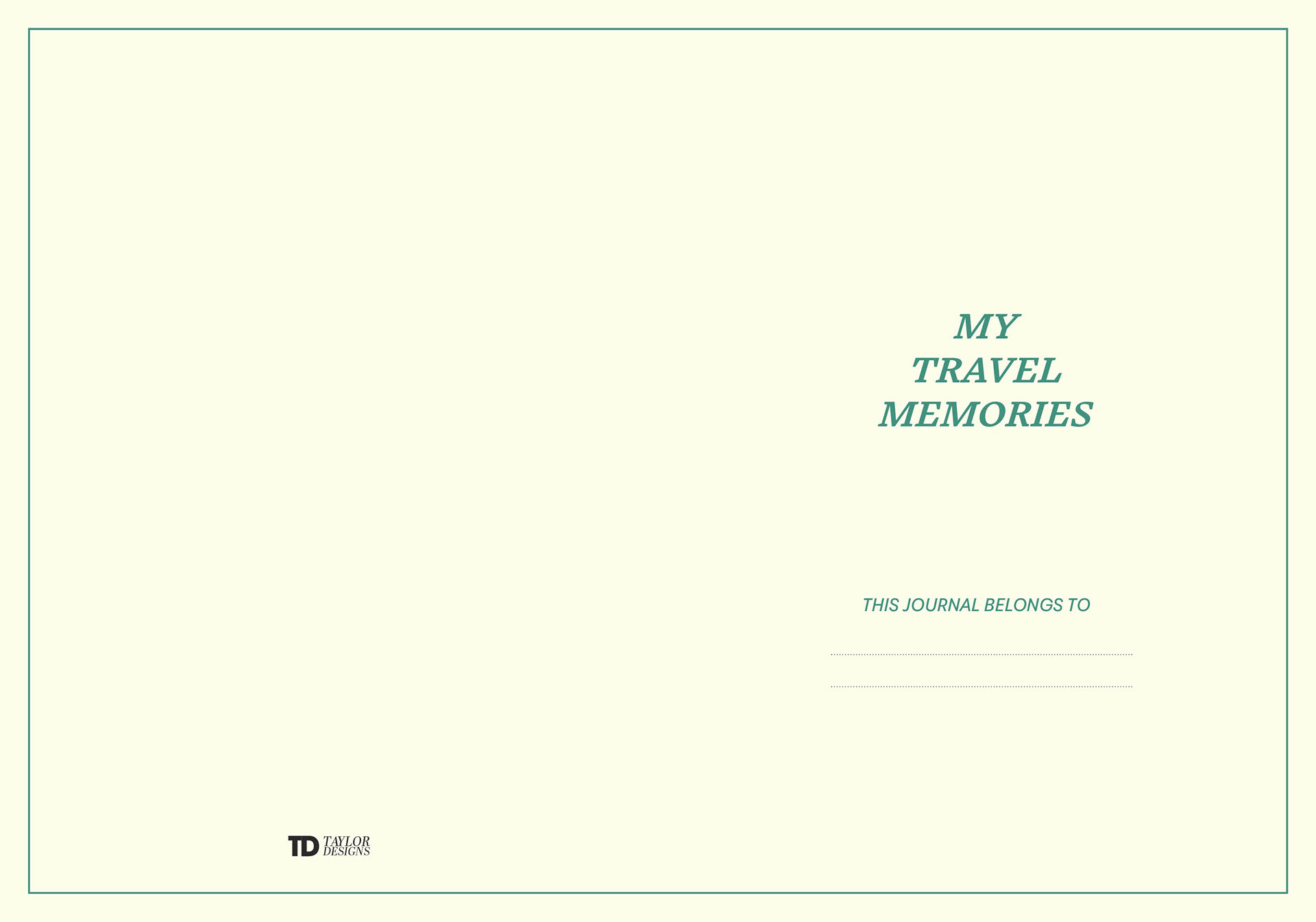
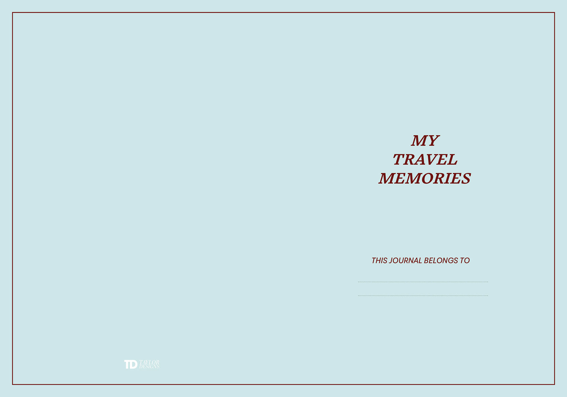
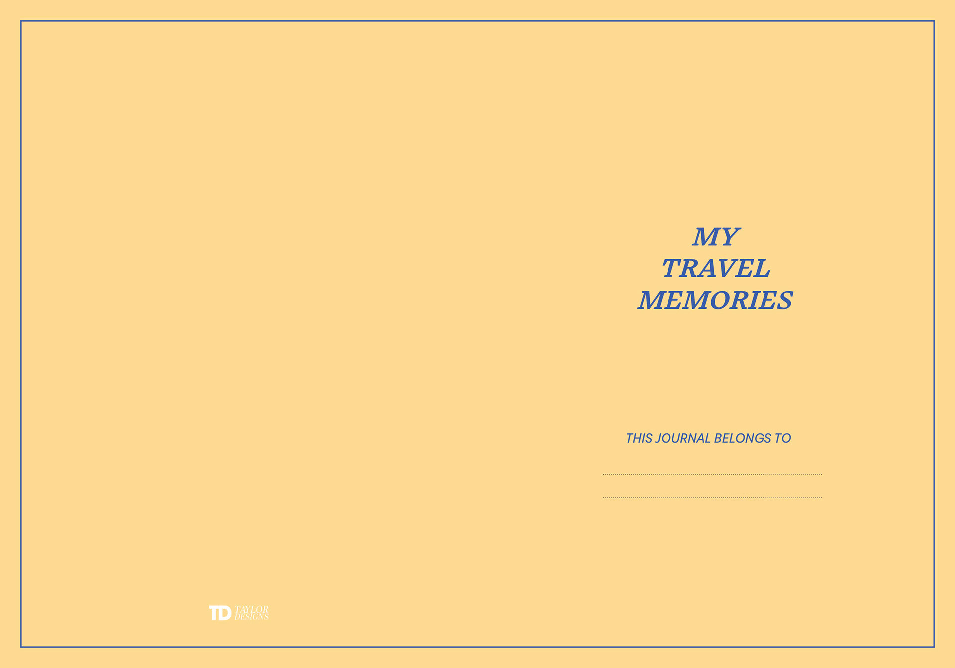
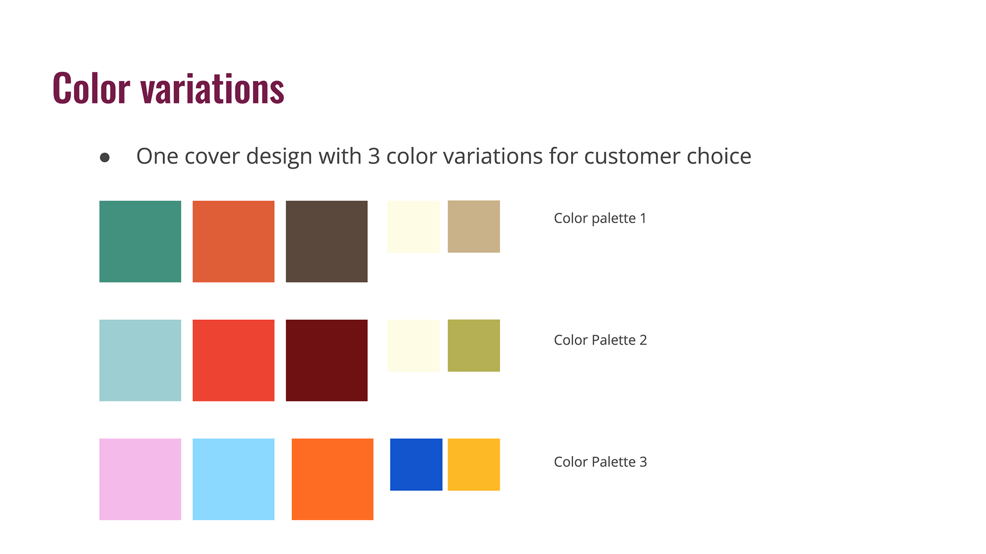
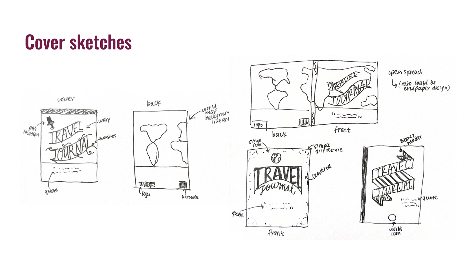
Finalized 3 cover layout designs with varying color palettes with the goal to reach a wider audience of travel enthusiasts. After printing the interior spreads and getting peer and mentor feedback, I leaned into the vintage design and feel of the spreads and translated that to my cover designs depicting vintage graphic travel tags.
Cover 1 spread
Cover 2 spread
Cover 3 spread
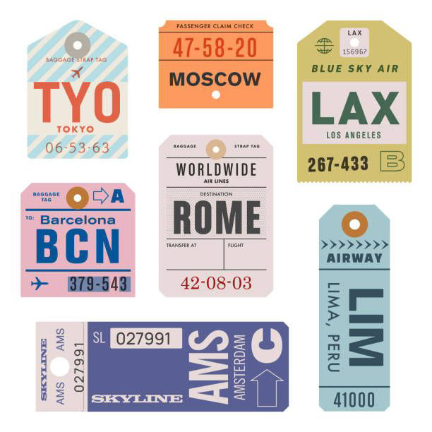
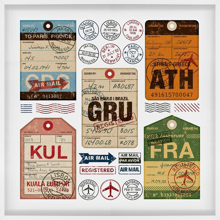
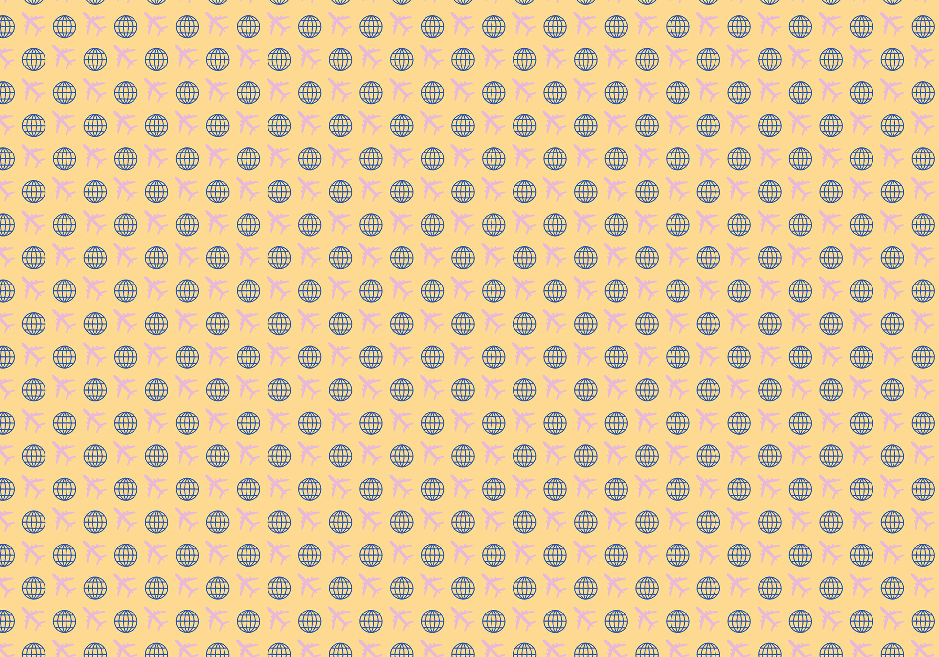
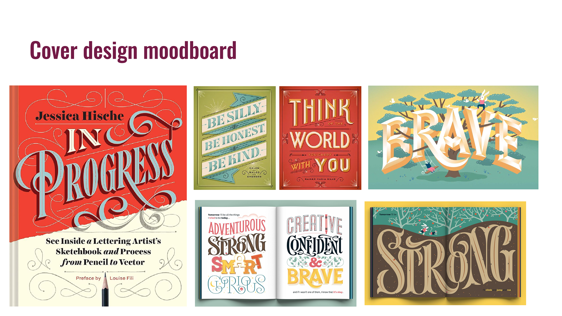
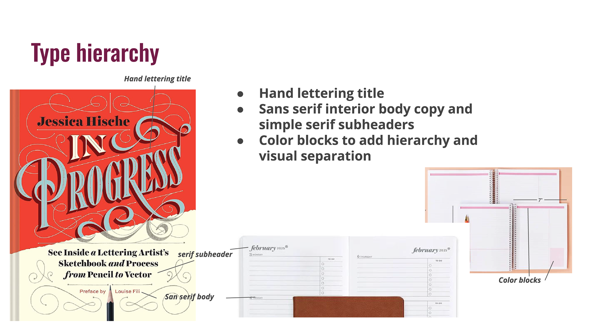
My inspiration for the cover designs were vintage travel post cards and travel tags. The type treatment of travel postcards inspired my header, and the destination tags and passport stamps inspired the spread of my design.
WEEK 13
This week I finished my other color palette options for the interior spreads and printed them at copy corner for my first test. I went with a simple saddle stitch bind to show the endpaper on the outsides and the spreads inside. I created 3 different books, one with each color palette. Below are my version 2 spreads including updates from my mentor comments and fine details to add to the design. I love how the color palettes turned out and think the variety helps aim to reach a wider audience of travel enthusiasts.
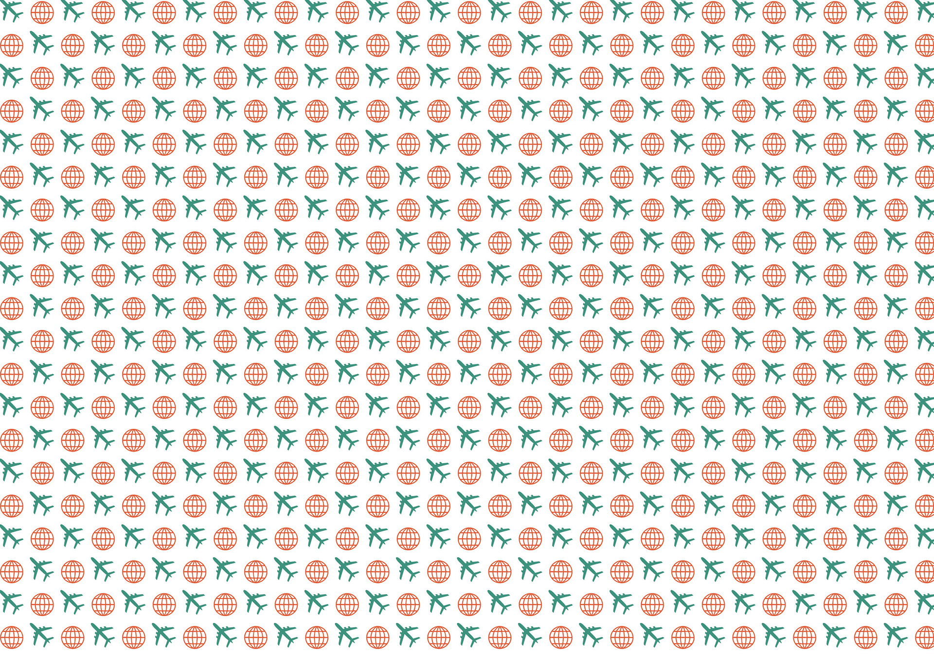
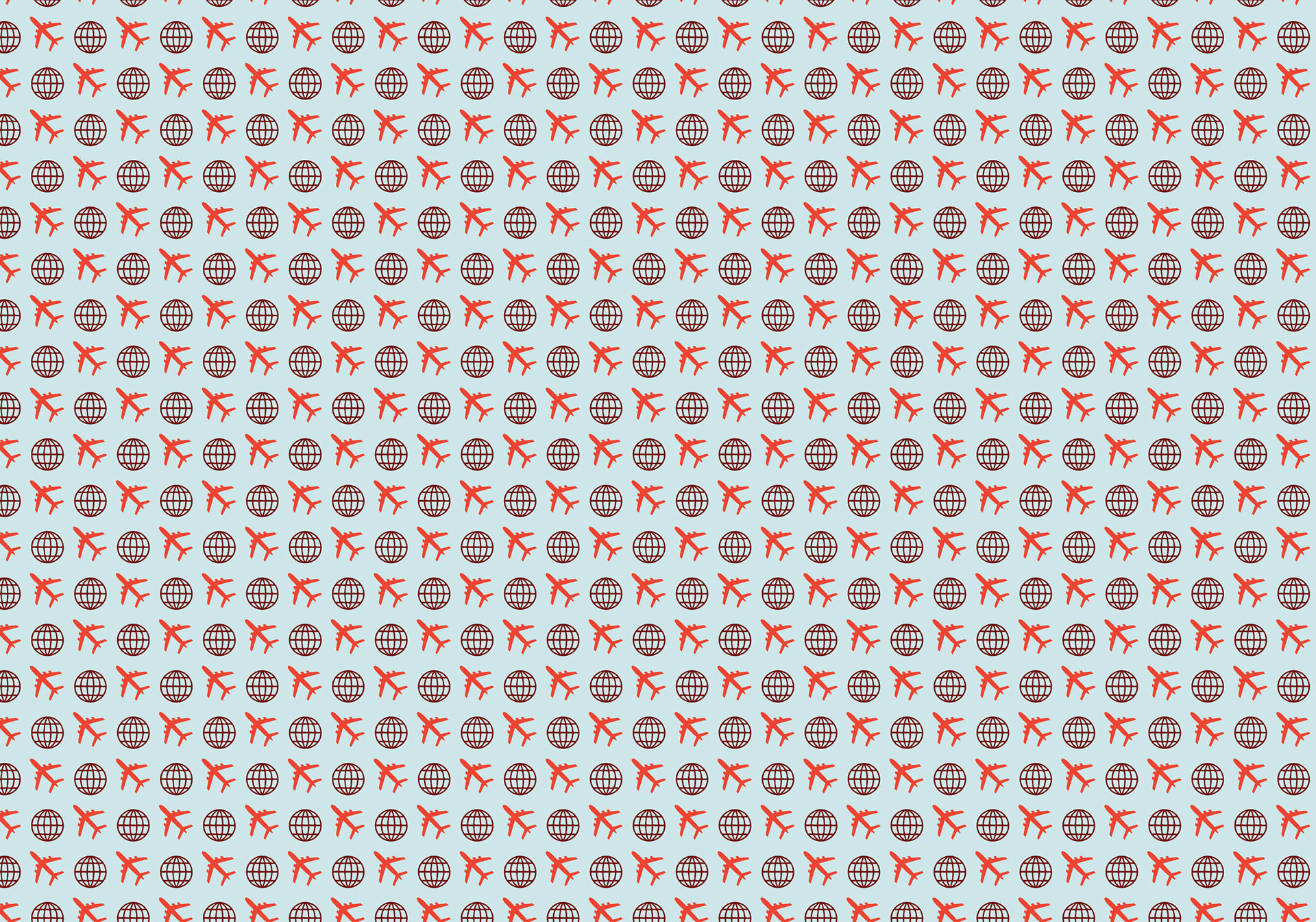


My cover design iterations include the 3 color palette options with 3 design options I am exploring. The first design has a bevel and extrude effect to emphasize the 3-D type, the second design includes the travel pattern in the background at a low opacity to fill the negative space, and the third design is a simplified type header to let the bright colors shine.


WEEK 12
This week I drafted my cover design with the 3 color palette options. I also laid out the interior spread of the journal. I met with my mentor to get feedback on my cover designs and talk about how to make the design reflect the 3D effect I am going for. She also gave me small edits on my interior pages so I am ready to test print.
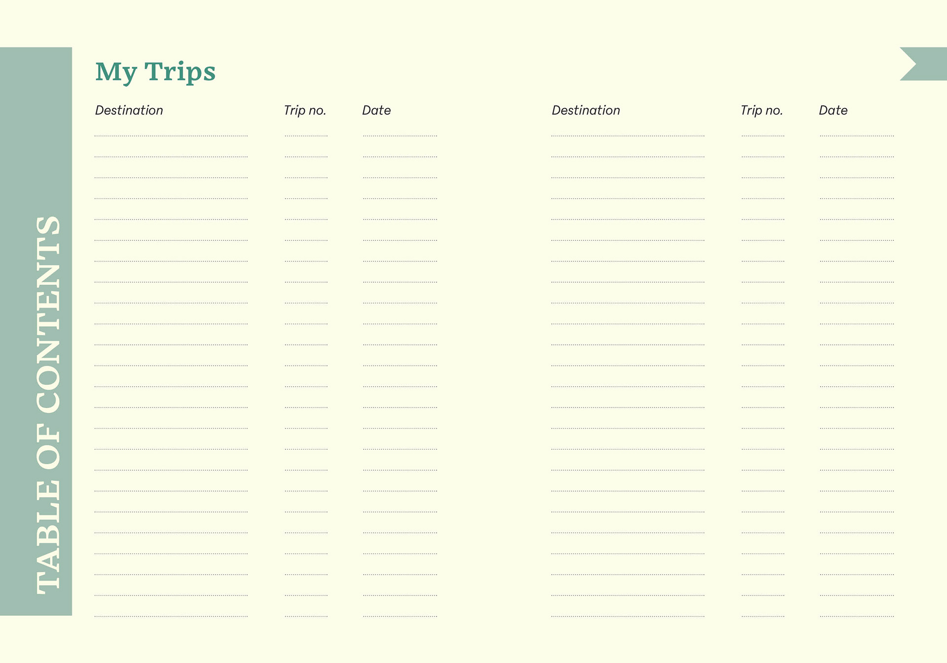
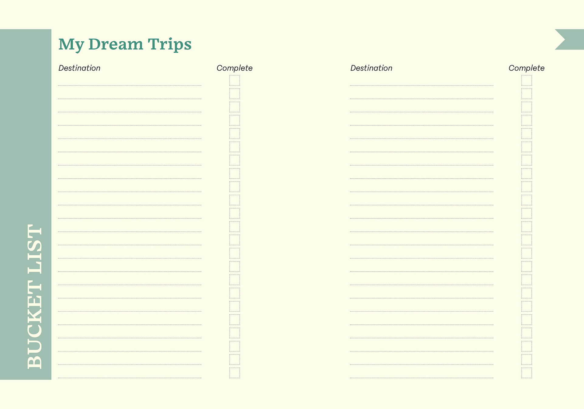
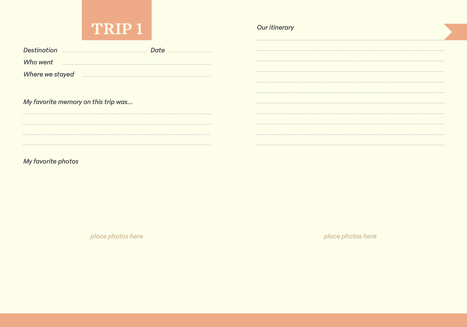
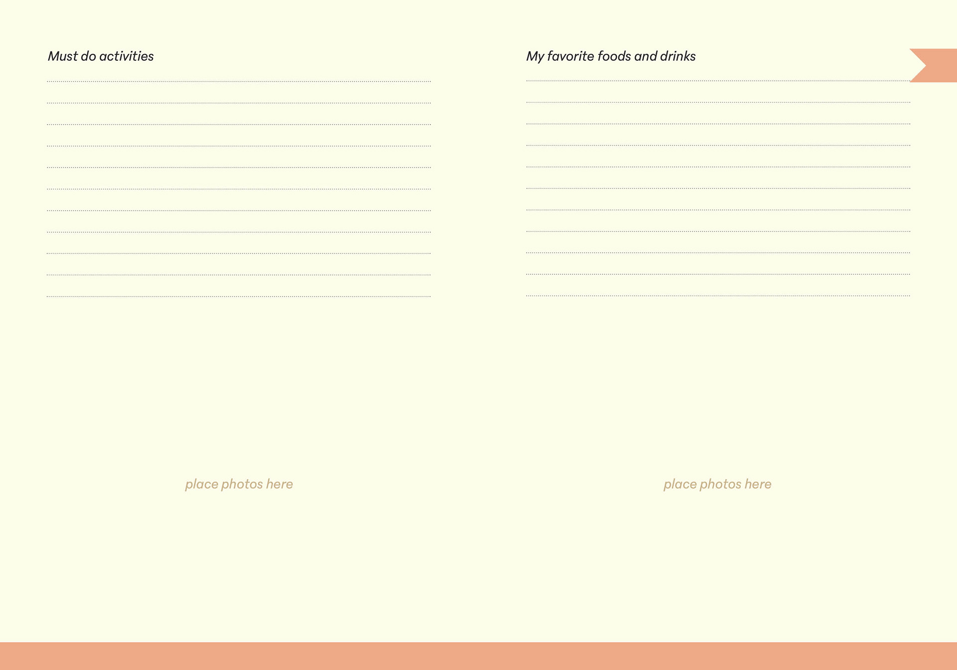
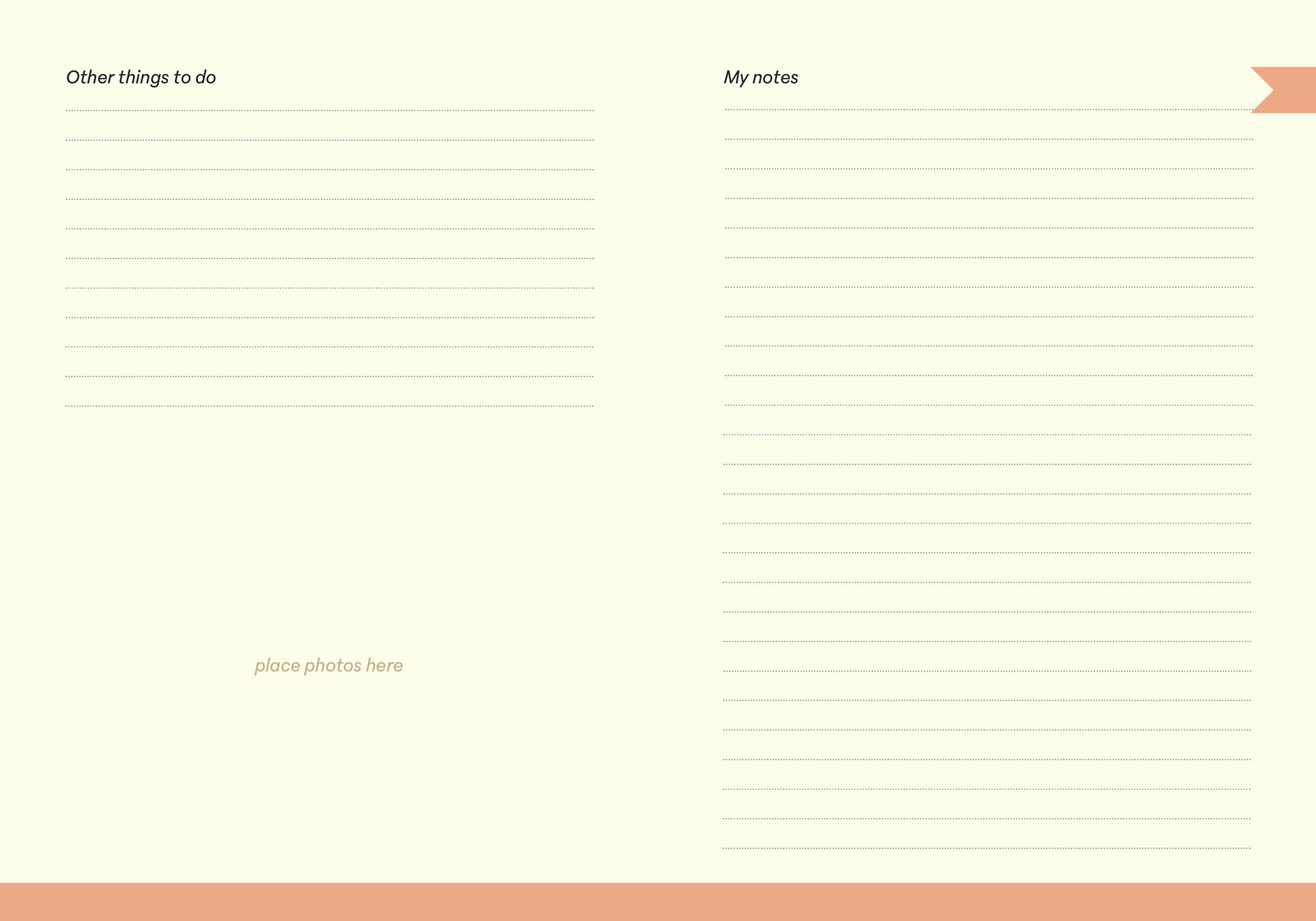
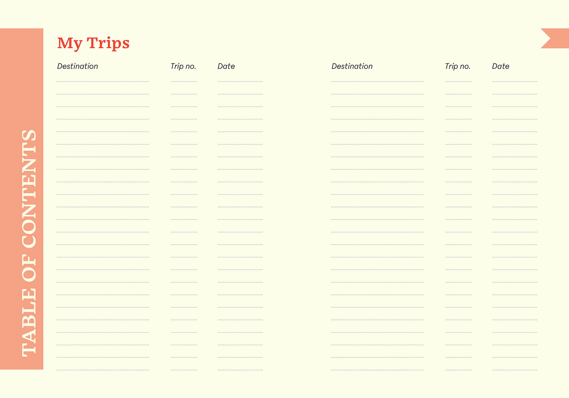
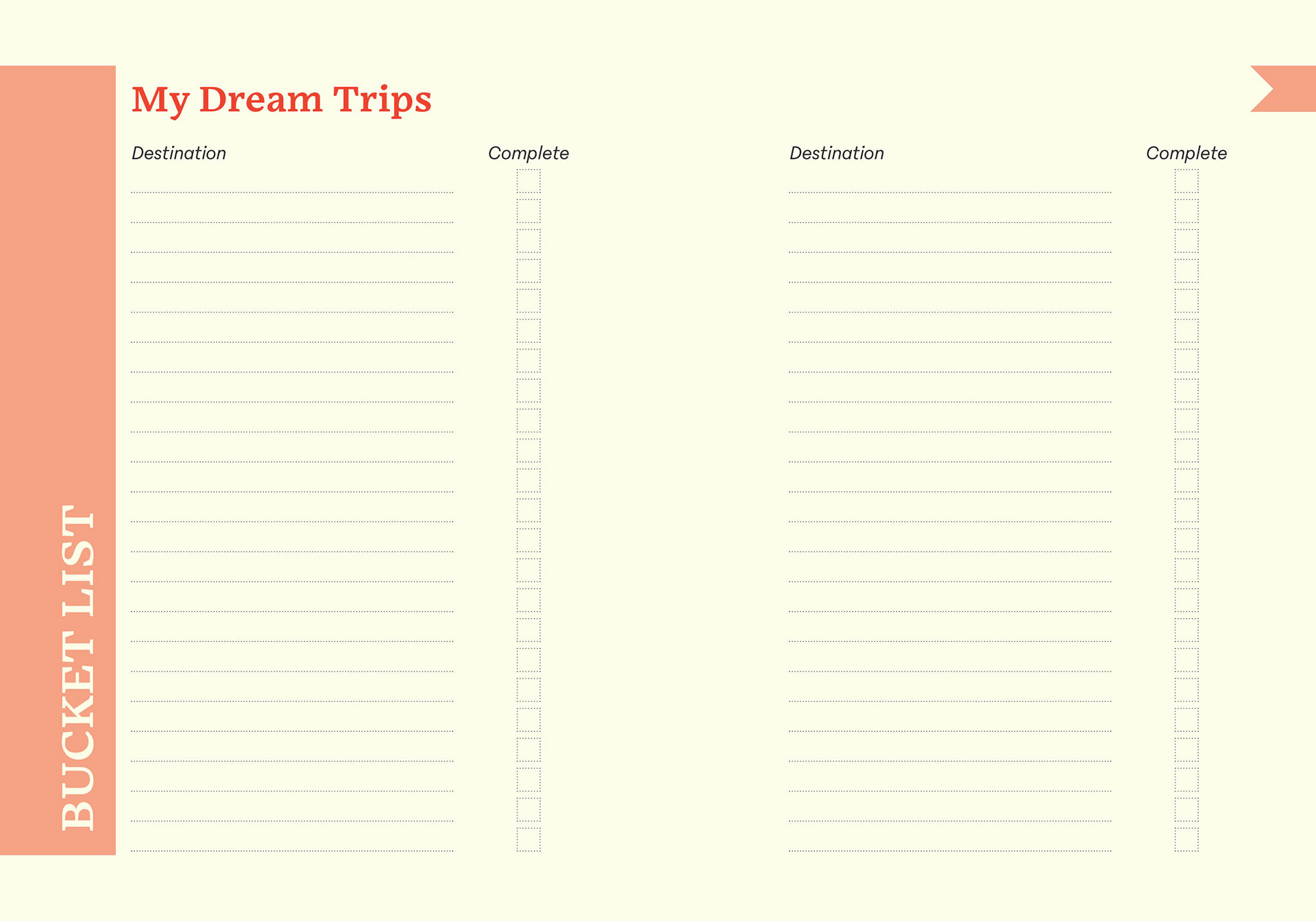
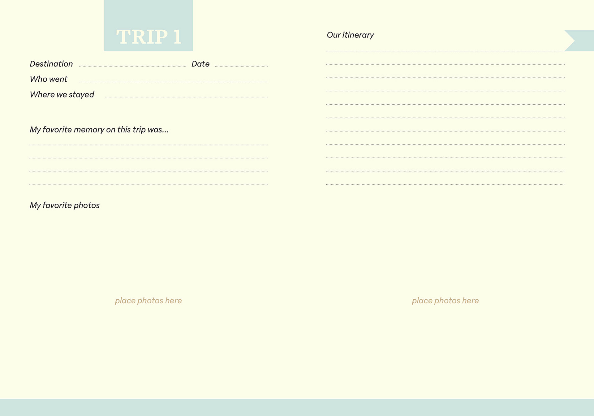
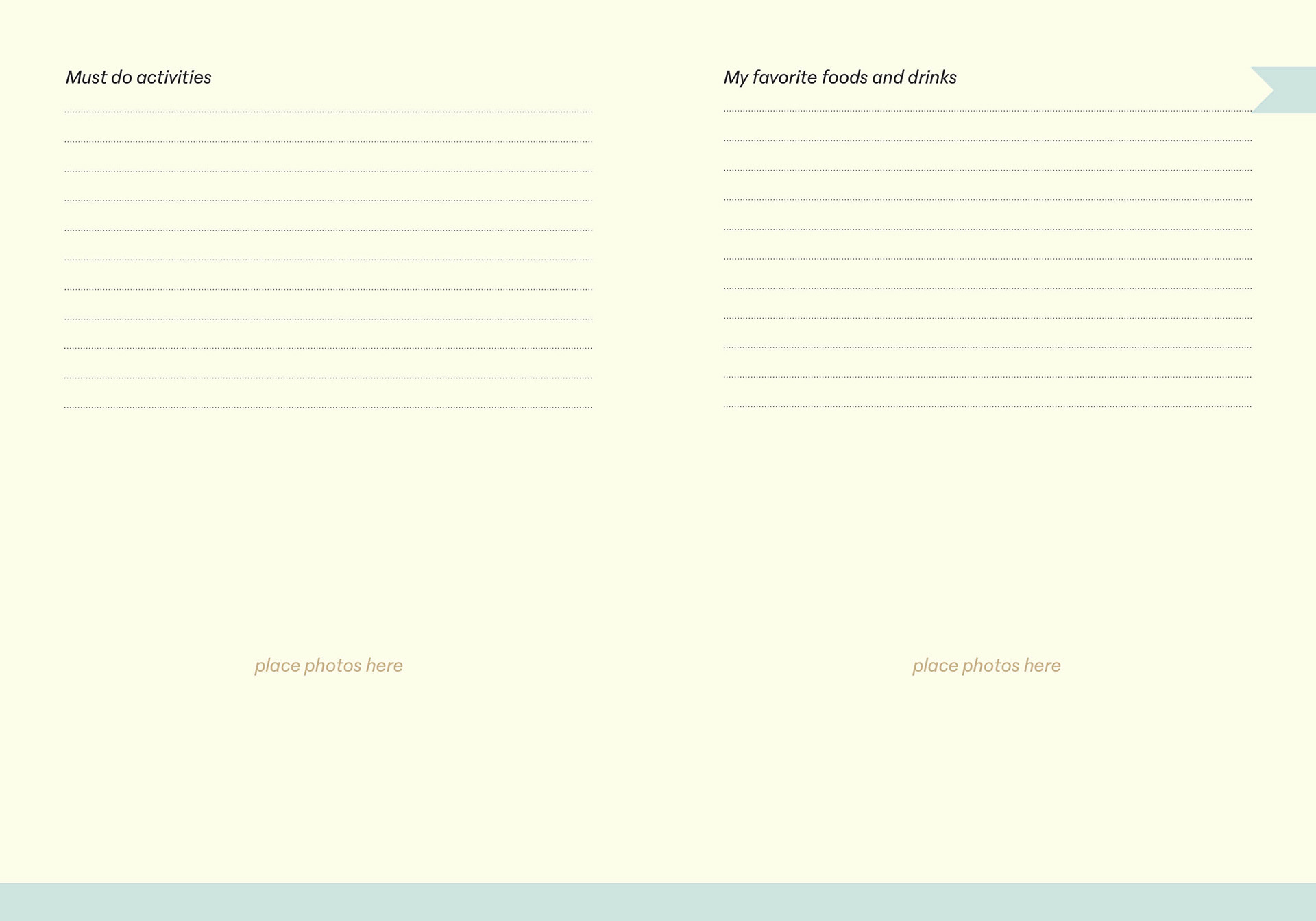
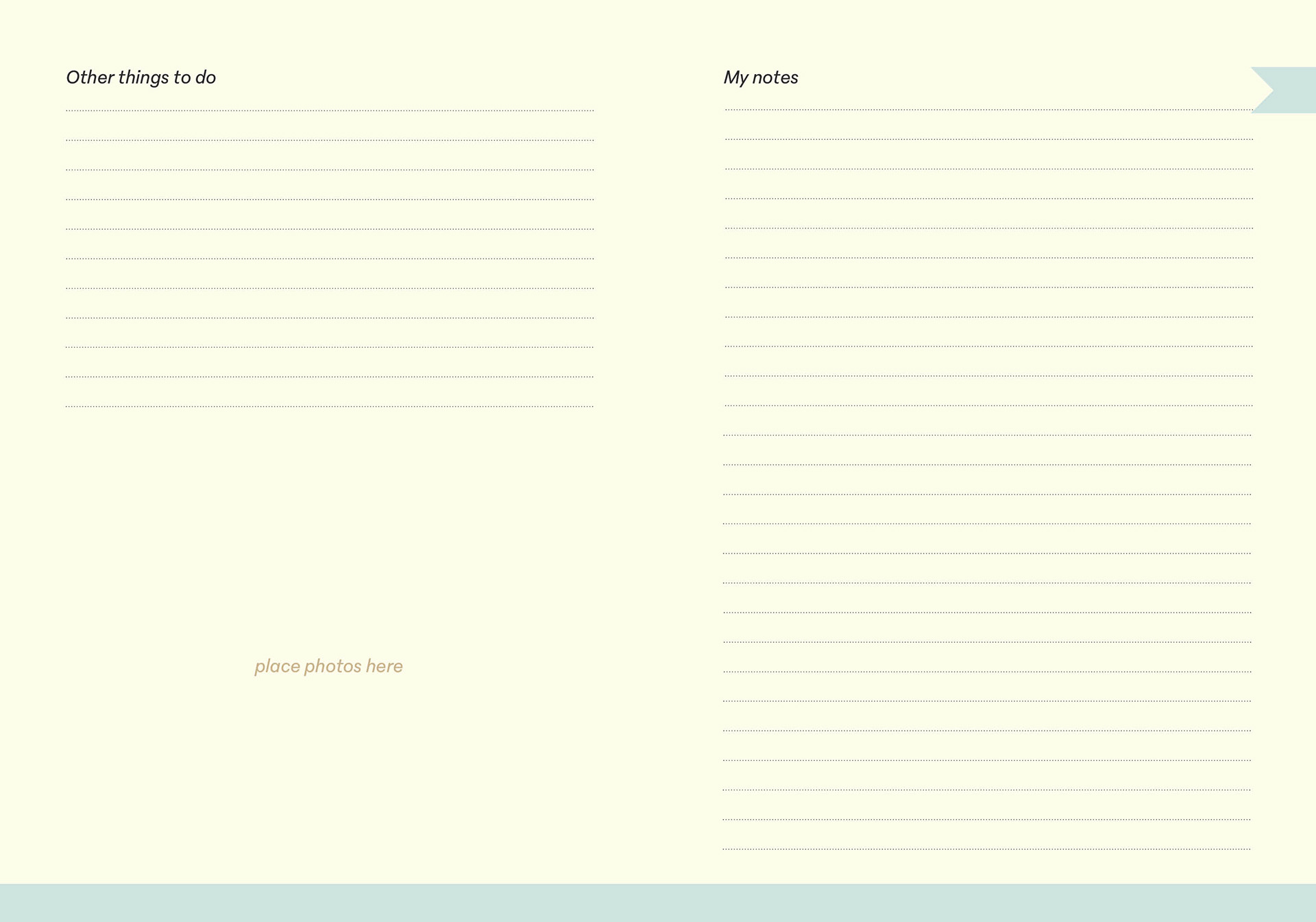
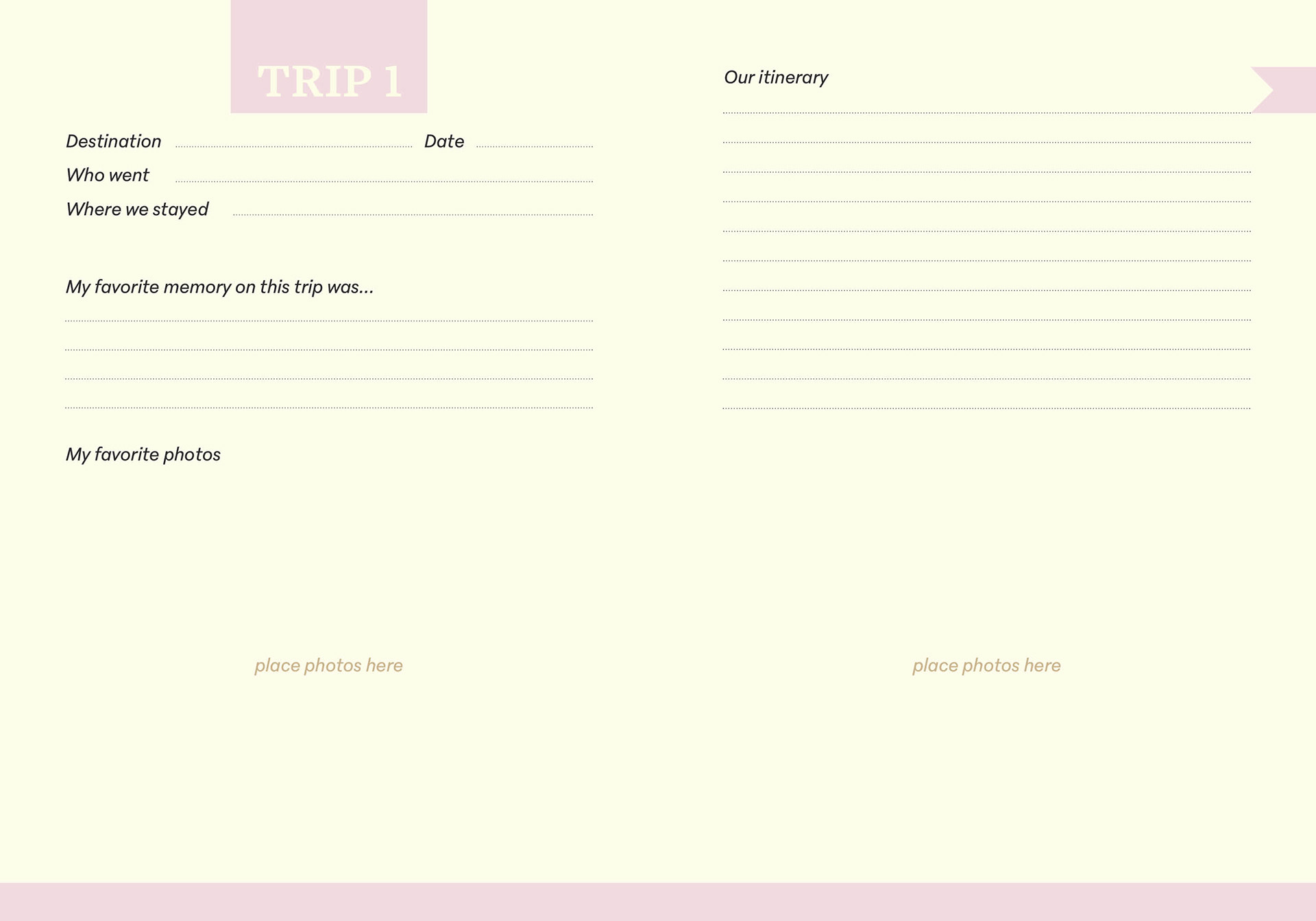
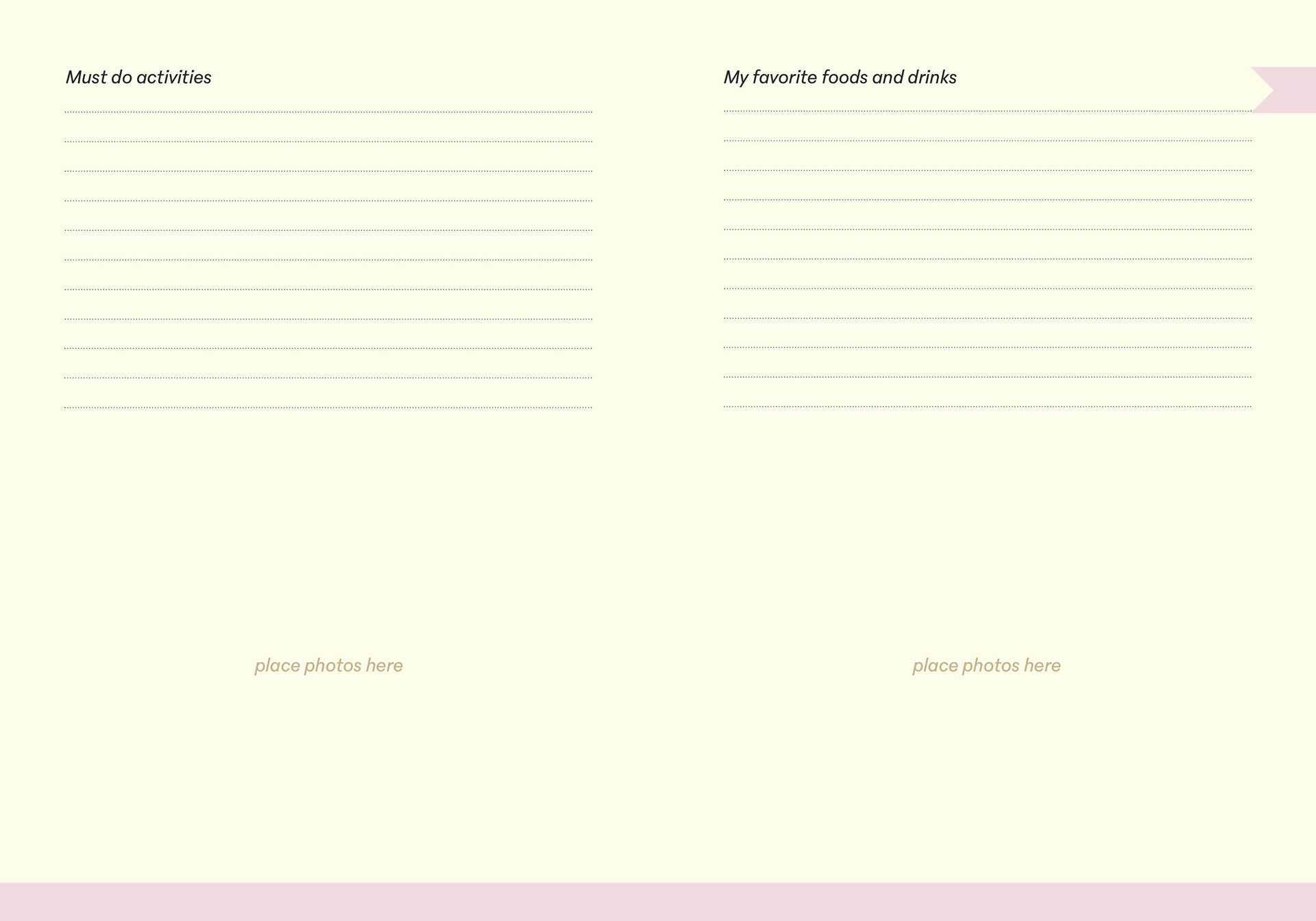
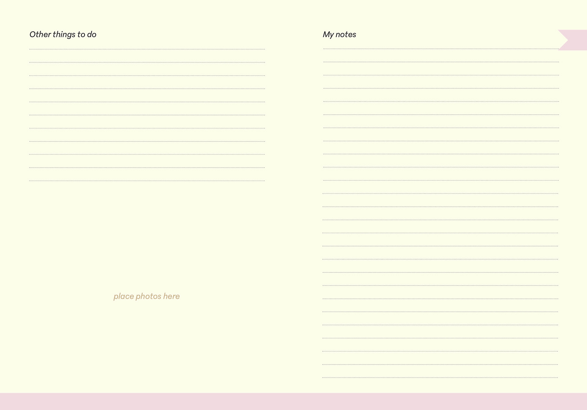
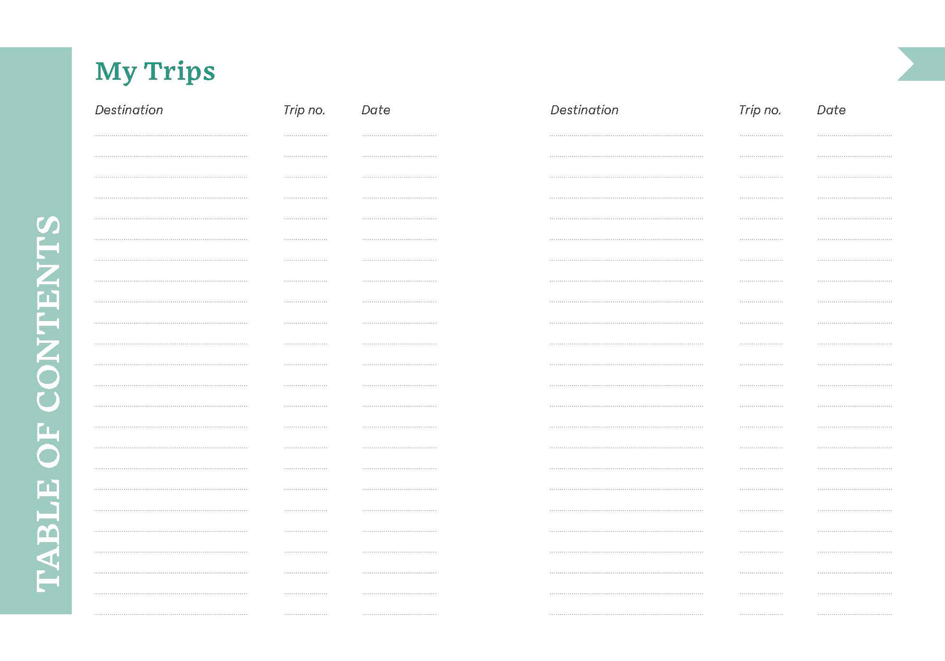
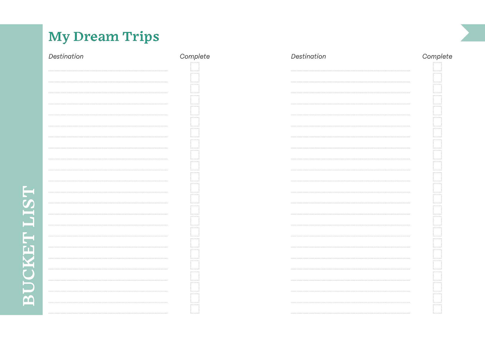
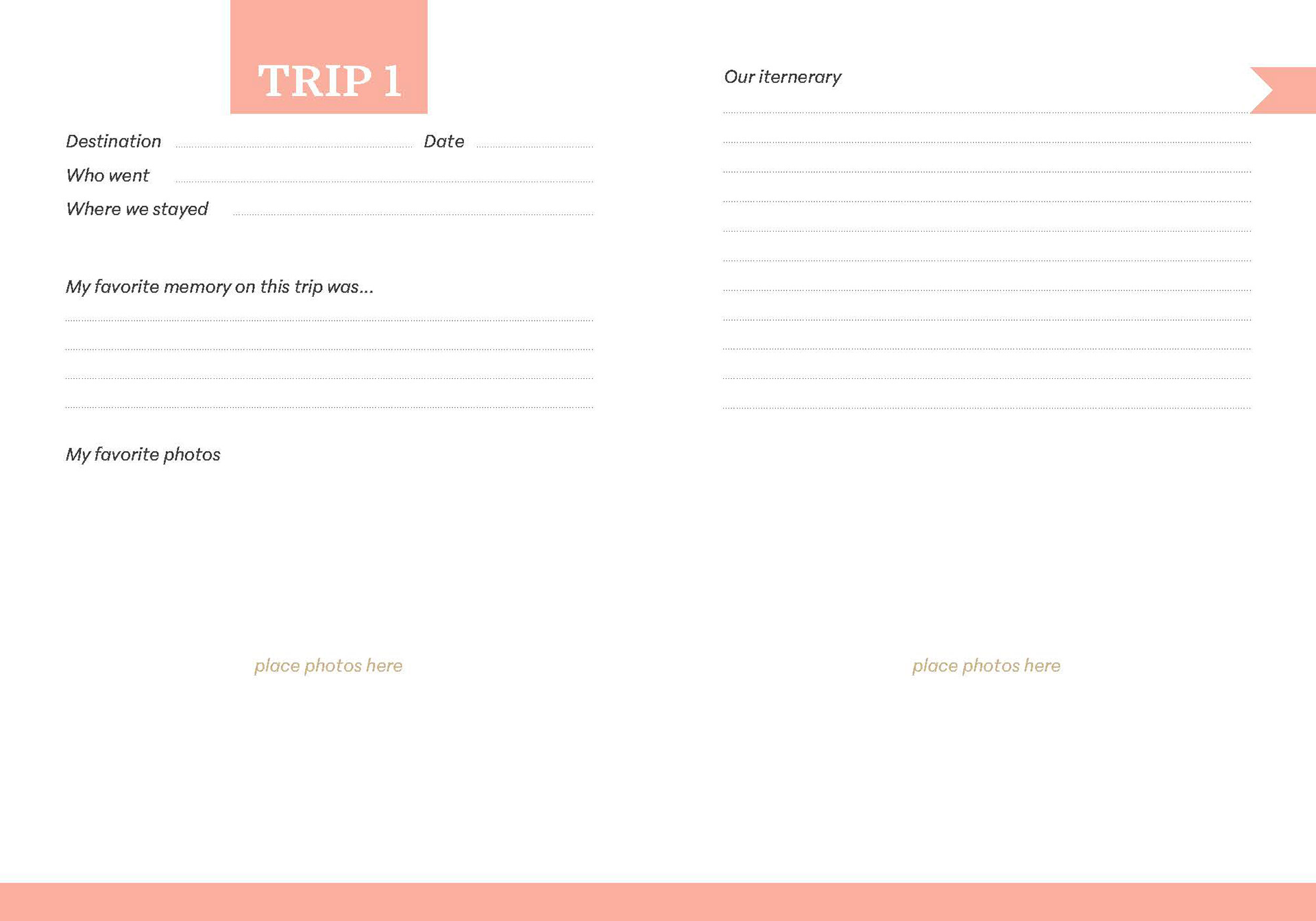
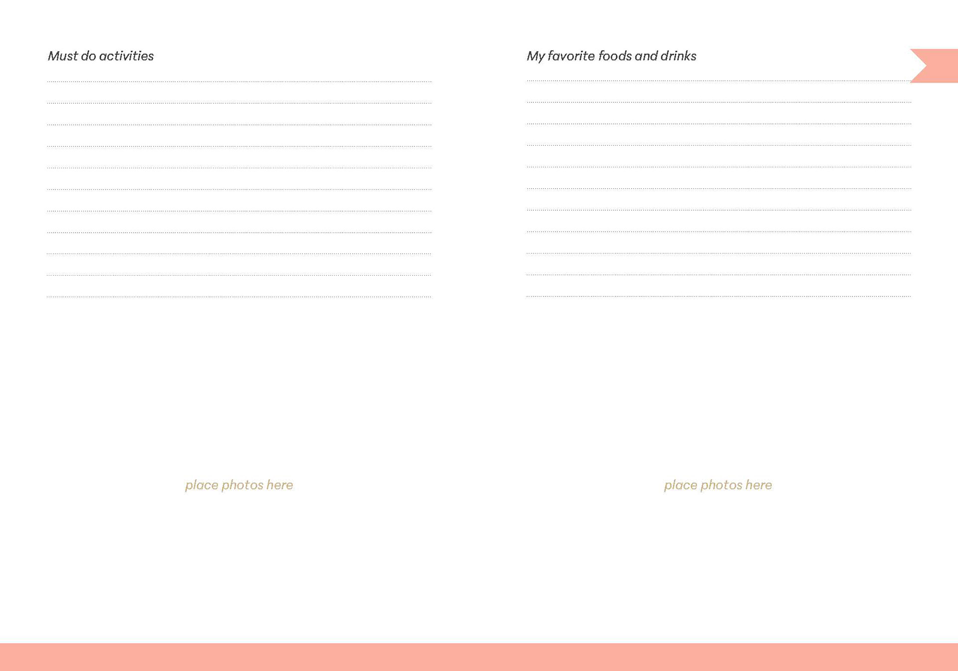
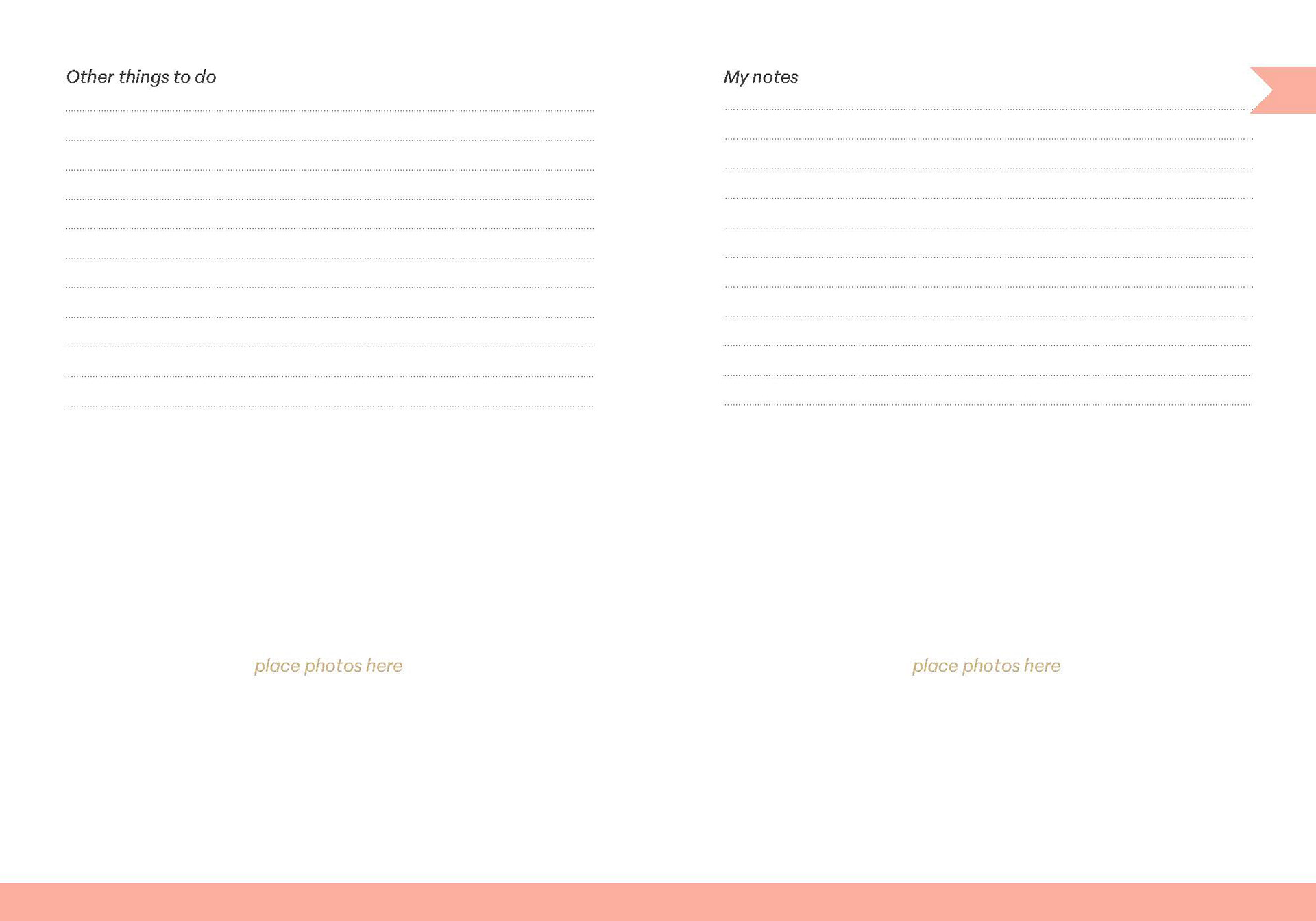
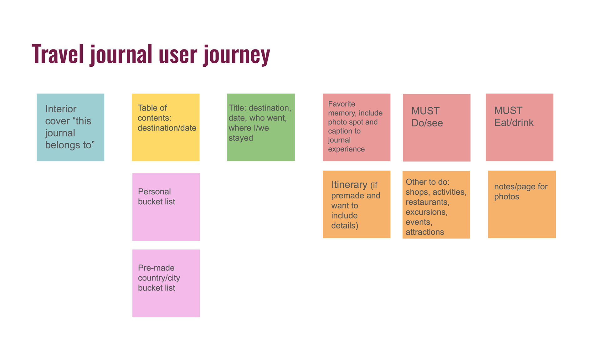
I tested my first version of the journal layout with one color palette including teal, orange, brown and cream. I created the Table of Contents and Bucket List pages first, followed by the first section for documenting a trip. The Trip One layout is laid out to show the first spread you would buy in the journal, this includes the general information with the destination, date, who you went with, and where you stayed. This same page has a space to journal about your favorite memory of the trip and include photos. All of the following pages are interchangeable and customizable for the users choice. These pages include an itinerary, must do activities, favorite food and drinks, other activities, and notes. Simple elements like the color bookmark tag, color bar at the bottom, and subtle dotted lines for writing add detail to the design to create a soft, delicate connection to the user. I met with my mentor Sarah about this initial design, she overall thought the layout worked really well. She just had small suggestions for spacing and lengthening the lines as well as testing a cream or off-white color in the background to test what paper may look best with the colors. I made these updates for version 2 and implemented my other color palette options.
JOURNAL DESIGN MOODBOARDS
TAYLOR DESIGNS BRANDING CONCEPT
WEEK 11
Milestone 2 consisted of creating my brand, Taylor Designs, further research on material selection, as well as creating moodboards for the interior spreads and cover illustrations of the travel journal itself. Establishing my brand and the focus of material research was the biggest priority in this milestone to propel the project forward to the final design. This week I presented all my progress so far including my finalized brand identity, further material research, beginning paper outline and annotated bibliography, journal user journey and cover design sketches. After feedback from my milestone presentation, this week my focus was to organize my user journey to draft interior spreads of the journal layout.
WEEK 10
Case study research for material selection in production processes. This elevates the importance of the interactive experience of my project by choosing the right material to connect with my target audience and create a memorable experience. I also made my milestone 2 presentation with updates for my journal mood boards and completed Taylor Design's brand.
WEEK 8/9 (spring break)
Research bibliography outline.
WEEK 7
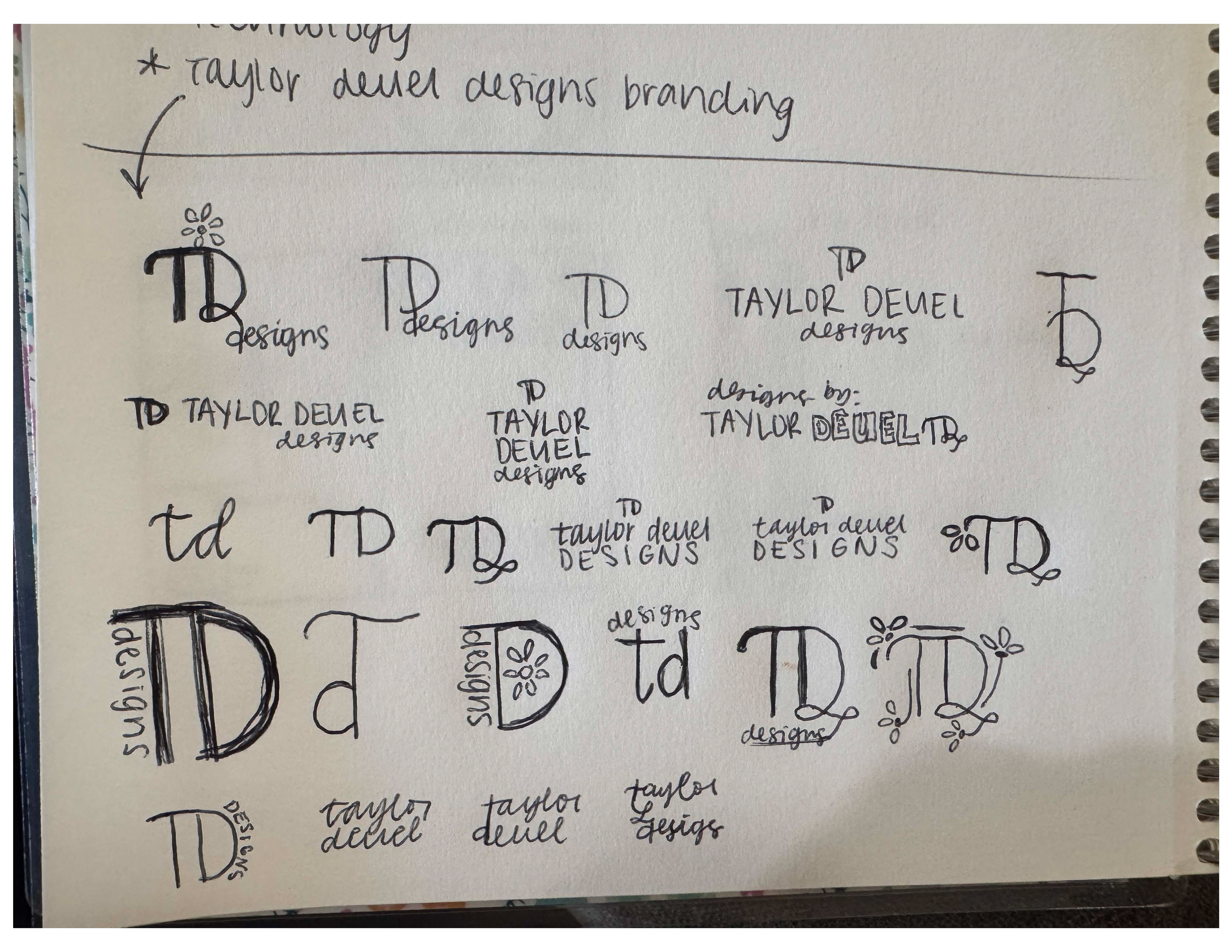
This week I am Logo and brand design concept designs. Below is my finalized logo concept and brand elements of Taylor Designs.
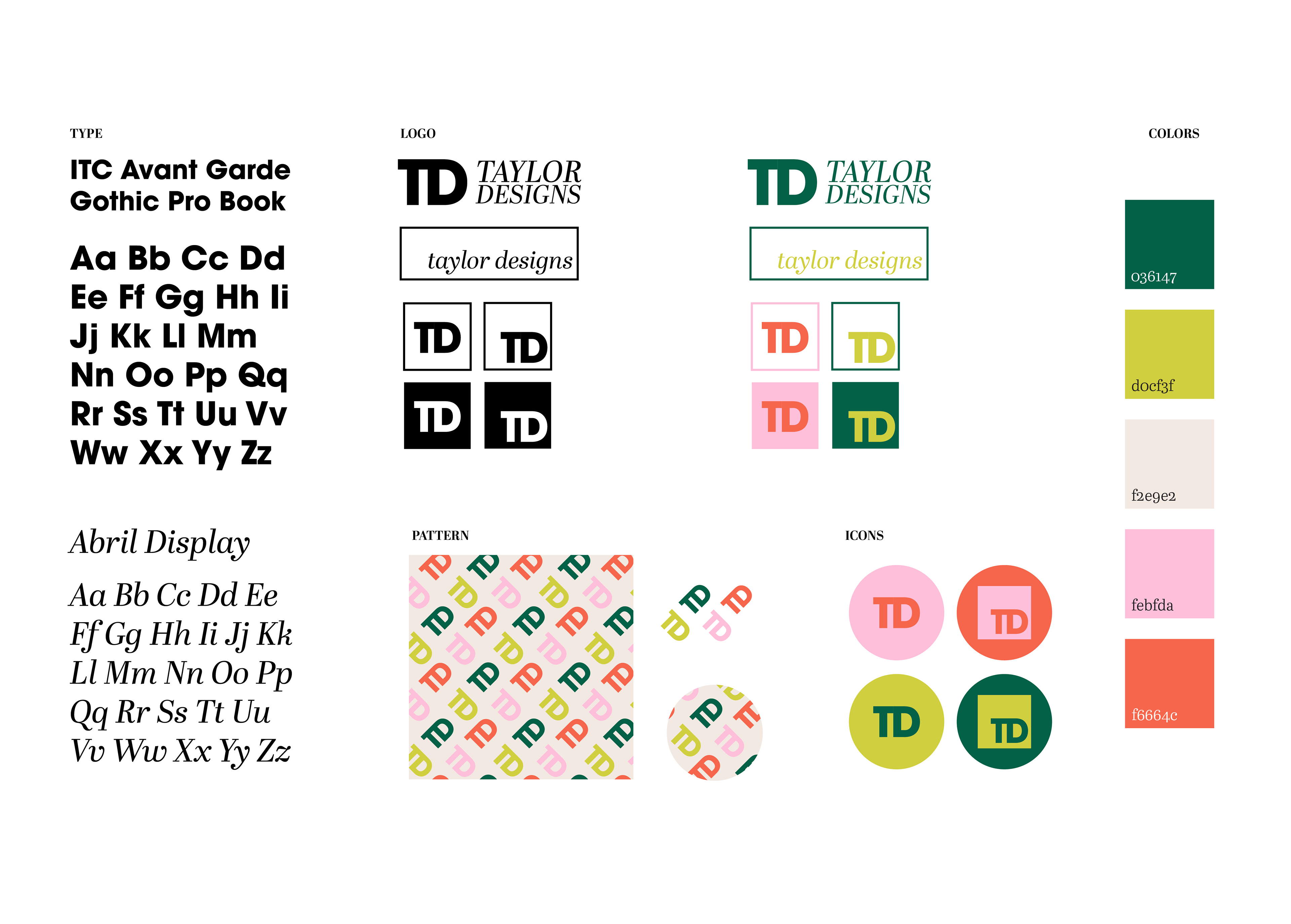
BRAND IDENTITY
Hi there, I'm Taylor!
My greatest joy is bringing a vision to life! I am a passionate creative and believe my purpose is to help others visualize their story through design. I love graphic design, personalized projects and exploring a variety of mediums including print design, social media, photography, interactive design and more! A unique skill of mine is blending illustration, typography, and digital media to craft visually compelling designs and uniquely tell a story.
I believe everyone has a story worth sharing and our experiences shape who we are. I'm excited to connect with you and hear your story! Let’s bring your vision to life together!
BRAND VALUES
INTENTIONAL every design is created with intention, meaning, and a story to tell.
ORIGINAL designs that clearly communicate and capture your one-of-a-kind vision.
CONFIDENT empowering you to boldly express your brand with authenticity.
PROCESS
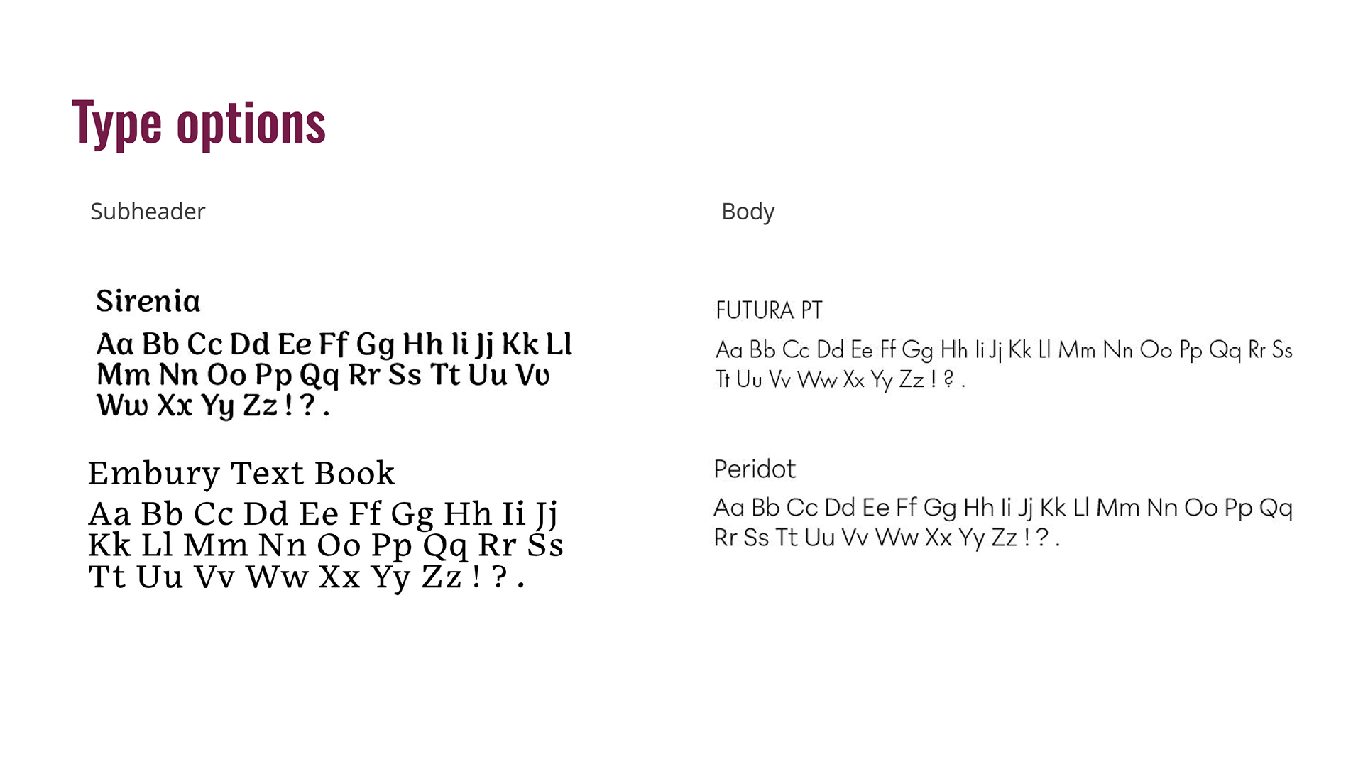
WEEK 5
Presented research and progress for Milestone One. I have gathered exceptional research to build a solid foundation for beginning to design and iterate in Milestone 2. This week I focused on my branding with creating a mood board, logo sketches, along with type and color options. I want my brand to bright and inviting and a place that fosters passion and confidence. I created a brand statement as well as 3 brand values to reflect my vision.
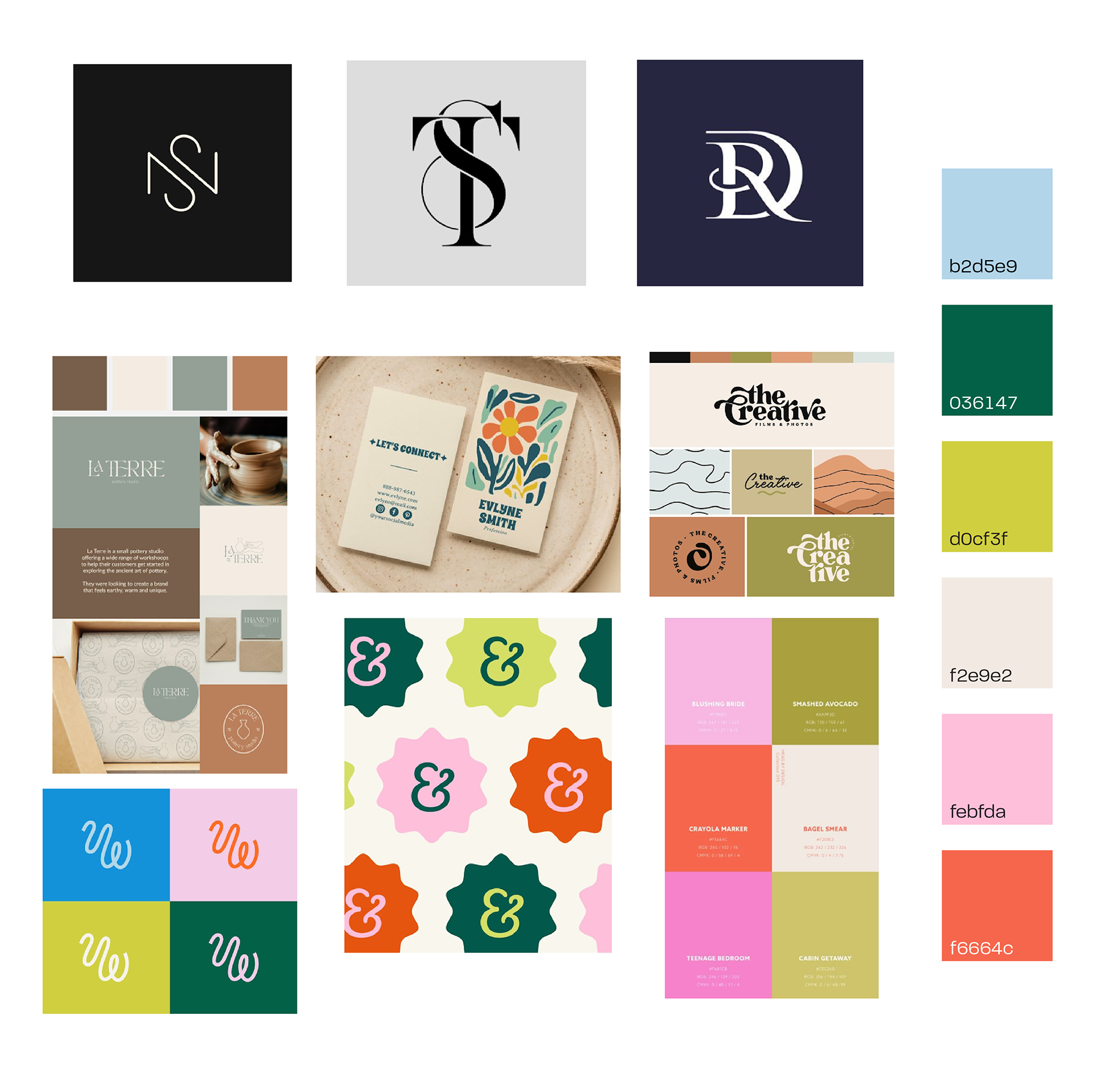
MOOD BOARD


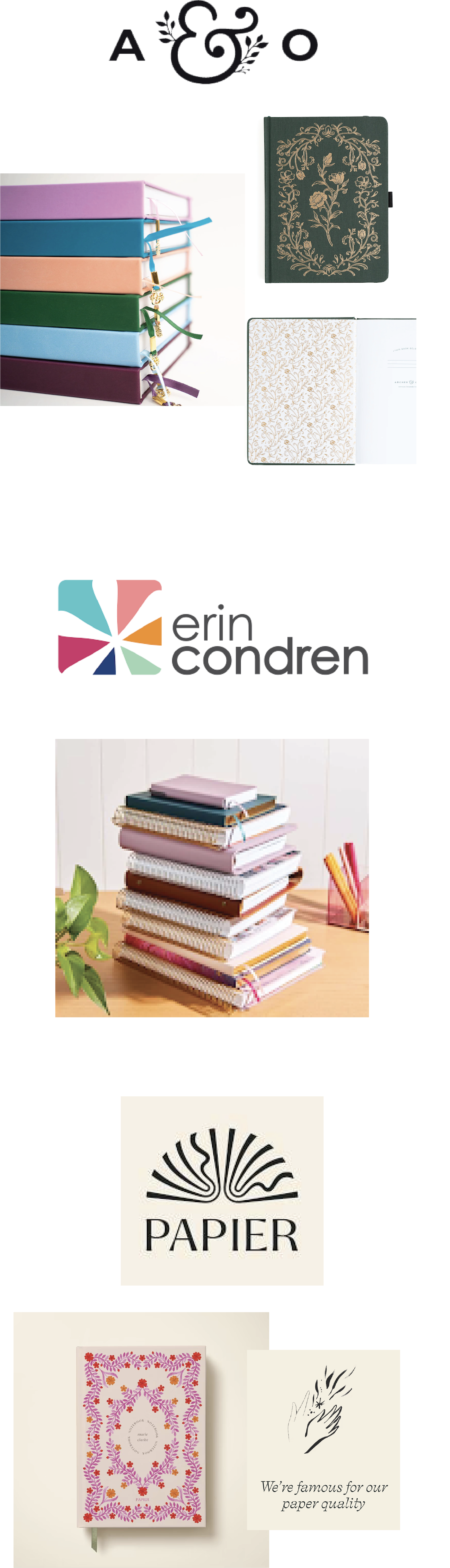
BRANDS ON THE MARKET
Thick, No-Bleed Pages – High-quality 160 GSM paper prevents ghosting and bleeding, making it perfect for pens, markers, and even paint.
Lay-Flat Binding – Sturdy hardcover design with a lay-flat spine for easy journaling and sketching.
Aesthetic & Minimalist Designs – Elegant covers, often with embossed details, cater to a sophisticated aesthetic.
Customizability – Offers personalized covers, layouts, and accessories for a highly tailored journaling experience.
Colorful & Inspirational Designs – Vibrant patterns, motivational quotes, and a fun aesthetic to keep you engaged.
Versatile Planning Options – Wide range of formats, from planners to guided journals, suiting various needs.
Elegant & Artistic Covers – Collaborations with artists and designers create stylish, unique journals.
Sustainability Focus – Uses responsibly sourced paper and eco-friendly materials.
Custom Personalization – Offers name, title, or monogram customization for a personal touch.
BINDING AND MATERIALS
The personal experience of my journal comes from interaction with the choice of materials just as much as the design of the pages and cover. I gathered many references to scan of journals I have that offer different varieties of paper and book binding techniques. I also explored three online journal companies to examine their product information including journal types, paperweights, binding options, sizes, designs, and customization styles (if applicable). I visited Newman's printing and Aggieland Printing to ask for samples of text paper and ask about binding options they offer.
Larry Baughman and Leeana Martinez at Newman's Printing showed me 2 sample books of text paper and cover options. Mr. Baughman gave me a sample of 80# natural white, 80# white (uncoated text) and 100# white (uncoated text) for interior page options. He informed me that cover material is ordered per job and I would be paying for the entire order of cover material no matter how much I am using. For types of binding in house, they can do a Perfect Bound glued spine, Spiral/Coil bind with metal or platic, or a saddle stitch with stapled sides
Aggieland Printing gave me 2 text paper samples, 70# and 60# white text, but did not have any options for cover materials I was looking for for my particular project. They may be an option for interior test printing to see what paper would be best for the interior layout.
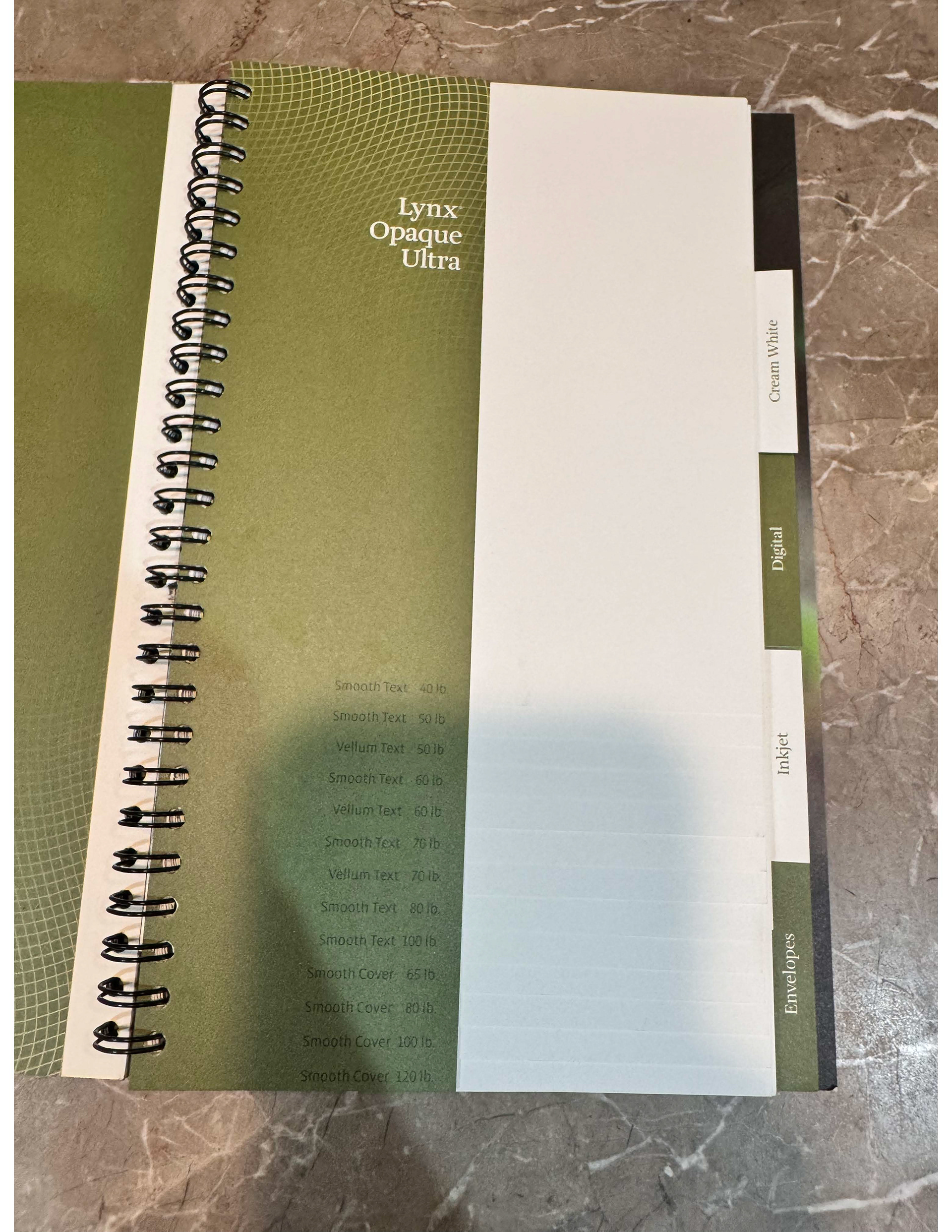
Lynx Opaque Ultra Text paper weights
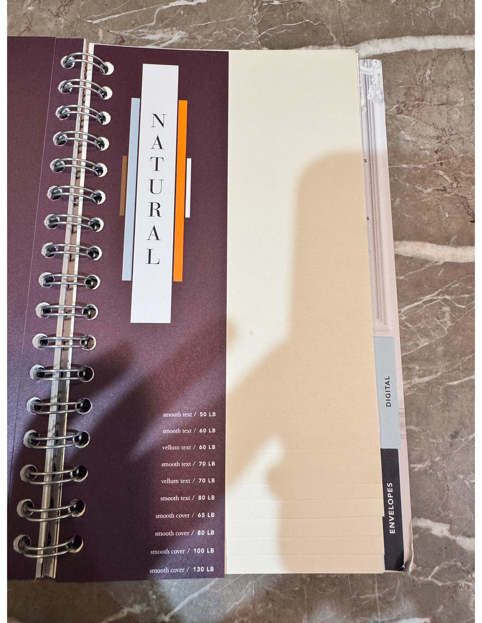
Natural paper weights
WEEK 4
Material research and interacting with journals. Met with my mentor to go over research progress. We looked at background research from last week, as well as user survey results and logo design sketches.
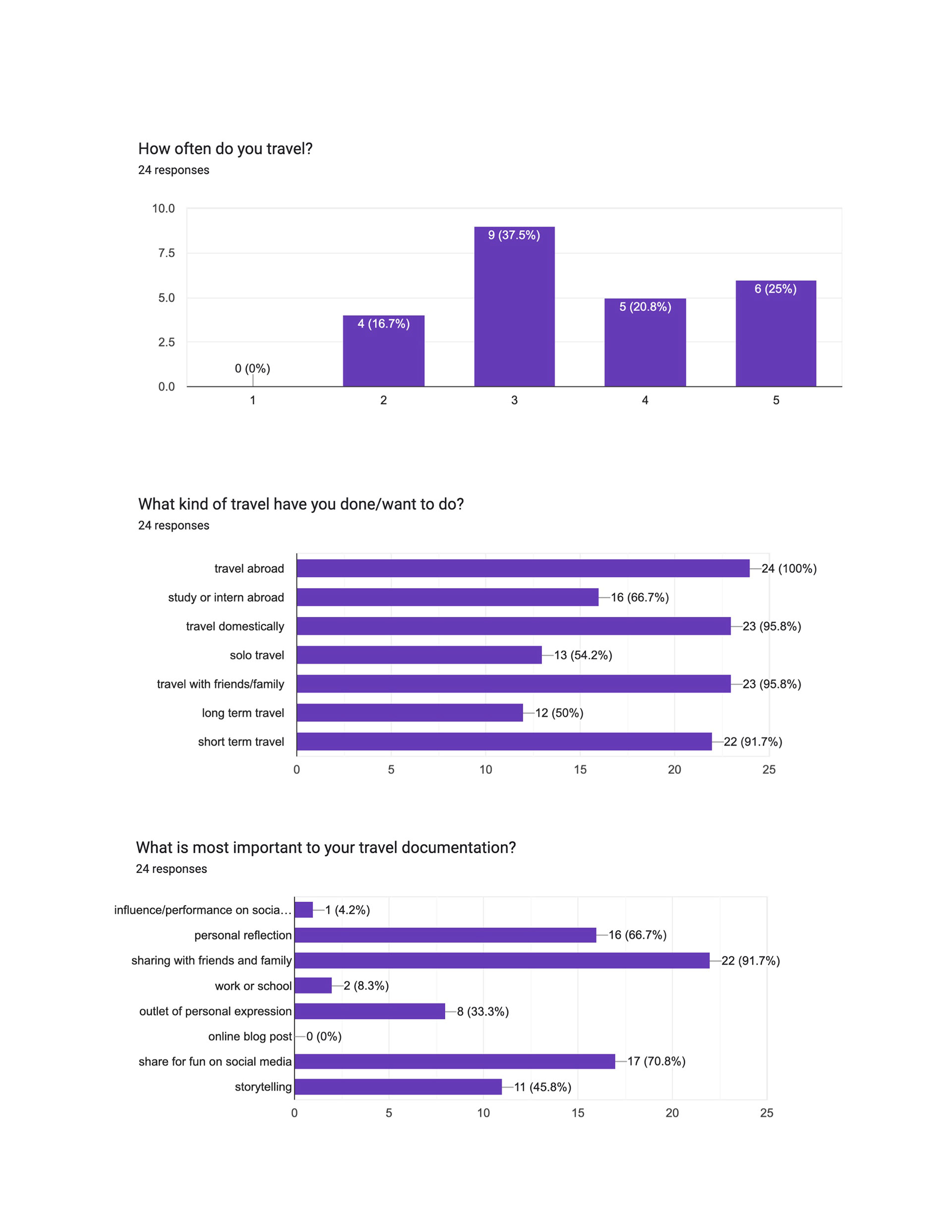
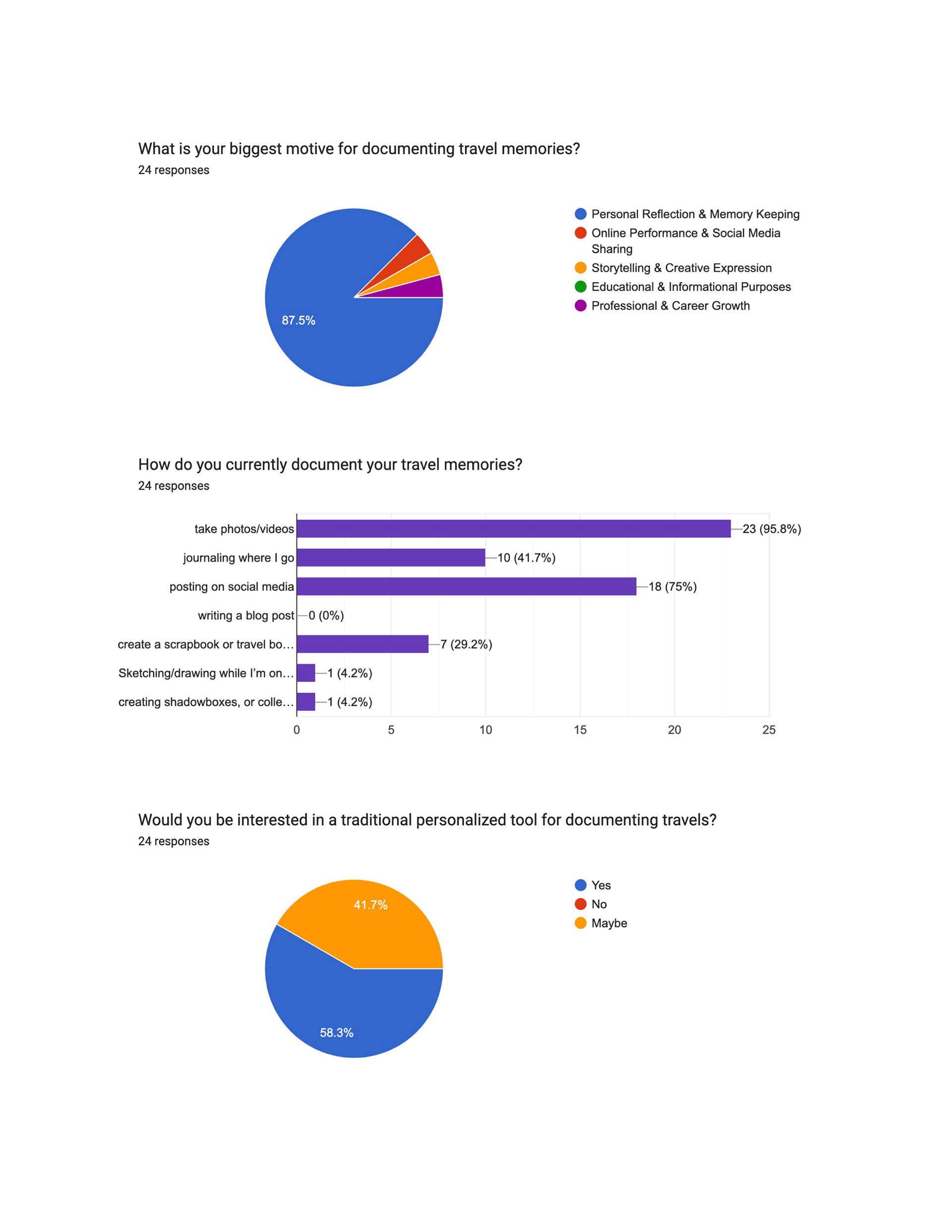
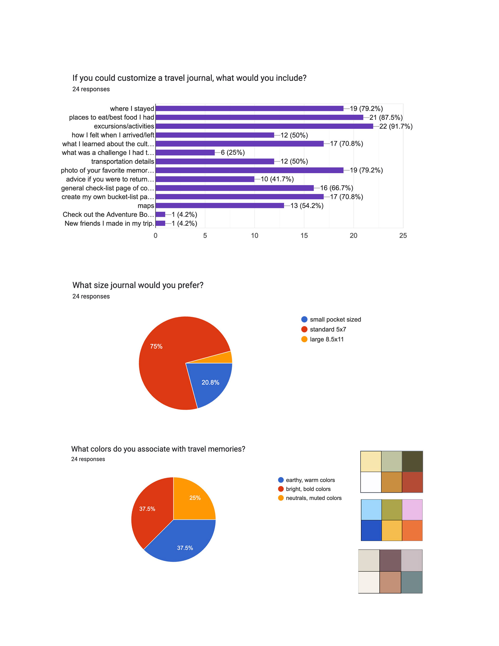
USER SURVEY RESULTS
PLANNING AND RESEARCH
WEEK 3
Published user survey and continued research on brand personality, marketing, and journal production methods. Found 3 main articles on each of these topics from blog author Julie Karen giving advice on working with clients and her own experience in creating a journal and an overall brand.
BRAND PERSONALITY vs IMAGERY
Building a strong brand personality helps drive positive consumer actions and fosters a relatable connection with the audience. Common brand personalities include excitement, sincerity, ruggedness, competence, and sophistication, as seen with Dove’s 'sincerity' and Nike’s 'excitement' in their brands. Furthermore, as much as consumers enjoy online shopping, studies show people still want personal interactions and direct customer service. Brand imagery consists of creative assets that communicate the personality and tangible benefits of the brand whereas a personality creates emotional association in the mind of an ideal consumer group. A well-defined personality helps a brand resonate with its target audience, strengthening its market presence and increasing brand equity. Once my brand personality is established, corresponding brand imagery reflects it visually.
MARKETING
In her blog post "Marketing Ideas for Journal Creators," Julie Karen offers several strategies for effectively promoting journals:
Build Your Brand Early: Establish an online presence well before launching your journal. Develop a brand, create a website, and engage on social media to connect with potential customers. This foundation ensures there's an audience ready when your journal becomes available.
Offer Free Downloads: Provide a printable worksheet or sample page from your journal in exchange for email sign-ups. This approach not only builds your mailing list but also allows potential customers to experience your journal's value firsthand.
Share the Creation Journey: Document and share your journal creation process through photos, videos, or blog posts. Highlight inspirations, design choices, and behind-the-scenes moments to engage your audience and build anticipation.
Design Timelessly: For your initial product, opt for a design that remains relevant over time. Avoid elements that can quickly become outdated, such as specific dates, trendy themes, or evolving logos. This ensures your journal remains sellable for an extended period.
Use Customizable Branding Elements: Enhance your journal's appeal with accessories like belly bands, bookmarks, or bags. These can be customized for specific events or timeframes, adding a unique touch without altering the core product. For instance, a belly band can brand a journal for a particular year, while the journal itself remains undated and versatile.
By implementing these strategies, journal creators can effectively market their products and connect with their target audience.
PRODUCTION
In her blog post "Producing a Journal in a Small Quantity," Julie Karen discusses the advantages and disadvantages of small-batch journal production and offers guidance on finding local printers.
Pros of Small-Batch Production:
Lower Initial Investment: Producing a limited number of journals allows creators to test market demand without committing significant funds, reducing the risk of unsold inventory.
Design Flexibility: Small runs enable experimentation with various styles or designs, helping determine which versions resonate best with the target audience.
Cons of Small-Batch Production:
Higher Unit Costs: Due to fixed setup expenses, the cost per journal is higher in small batches, leading to reduced profit margins compared to larger orders.
Limited Finishing Options: Certain premium features, such as embossing, debossing, foil stamping, or specialized materials like leather or faux leather, may be unavailable or cost-prohibitive in low quantities because of complex setup requirements.
Finding a Local Printer: When searching for a local printer, consider the following steps:
Define Your Specifications: Determine your preferences for cover type (softcover, hardcover, faux leather, etc.), interior printing (black and white or color), and binding style (glued, stitched, spiral).
Conduct Targeted Searches: Use search terms like "full-service book printer," "short-run book printer," or "short-run journal printer," possibly including your city or state to find local options.
Evaluate Potential Printers: Assess their experience by asking: Have they produced journals before? Can they provide samples of previous work or create a mock-up of your journal? Will the entire production be handled in-house or outsourced?
By carefully weighing these factors, journal creators can make informed decisions about small-scale production and select suitable local printing partners.
CASE STUDY
In her blog post "Designing and Producing a Journal," Julie Karen details her collaboration with motivational speaker Debra Searle to create the "Choose Your Attitude" Journal. The project encompassed design, layout, and production, resulting in two versions of the journal tailored to different audiences.
Project Overview:
Client: Debra Searle, a motivational speaker known for her "choose your attitude" philosophy.
Objective: Develop a journal that Debra could sell or distribute at speaking events, reflecting her branding and appealing to her diverse audience.
Design Process:
Audience Consideration: The journal was designed to cater to two primary groups: corporate audiences and women in Debra's age range who follow her on social media.
Cover Variations: Two cover designs were created:
A grey cover with a straightforward design for broader corporate appeal.
A teal cover featuring a handwritten font for a more feminine touch.
Interior Layout: The journal's interior included:
Title and copyright pages.
About the Author section.
Introduction and guides on using the journal.
Goal-setting sections.
Repeated journaling pages, which formed the core content.
A logo and information on obtaining additional copies.
Design Elements: Custom icons were designed to represent key themes, and a belly band was created to wrap around the journals, adding a cohesive branding element.
Production Insights:
Proofing Process: Despite thorough planning, the project underwent multiple rounds of proofs (at least ten) to ensure perfection before printing.
Printing: The journals were produced in China, with careful coordination to meet design specifications and quality standards.
This case study highlights the importance of understanding the target audience, meticulous design and layout planning, and rigorous proofing in creating a successful journal product.
WEEK 2
First mentor meeting. We talked about project scope and advice for the stages of research. She helped me envision a personalized style for my travel journal to engage with my audience and create a personable experience.
WEEK 1
Project proposal. My overview is to create a travel journal design, layout, and publication combining graphic design and layout design with my passions for traveling and journaling. This will provide a tangible outlet for storytelling, offering a personal and reflective alternative to mainstream social media influence. I created a timeline for the semester with deadlines for deliverables and milestones throughout the process.